Enak Eco: Building a Stronger Brand in Indonesia’s Seasoning Market
Brand identity rejuvenation, brand architecture and packaging design for ENAK ECO’s peanut-based sambal and seasoning paste portfolio.
How Komunikasia Strengthened Enak Eco’s Brand Identity and Clarified Its Product Portfolio
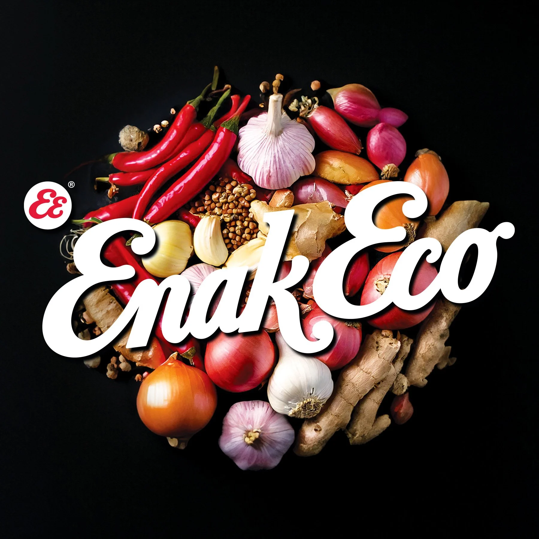
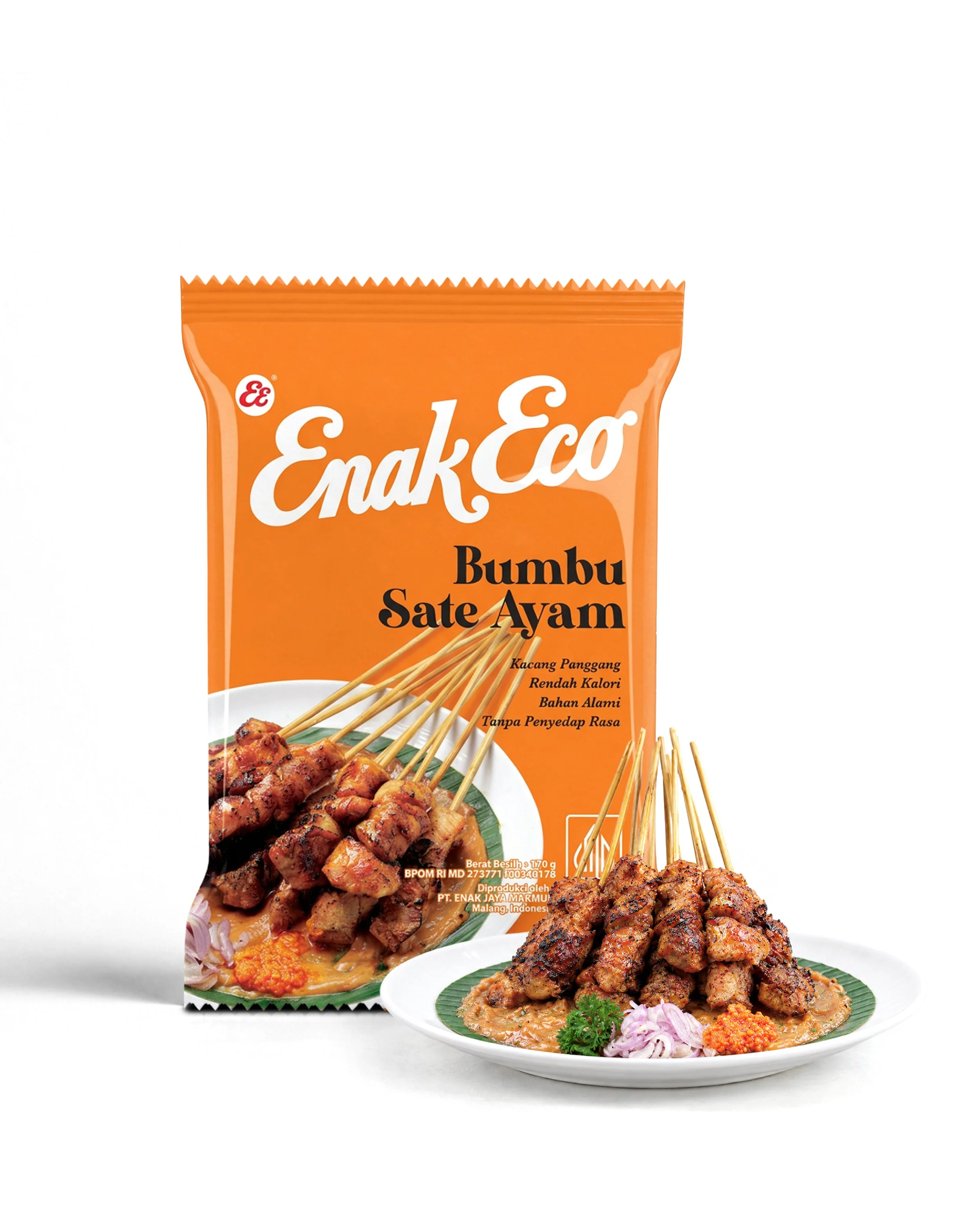
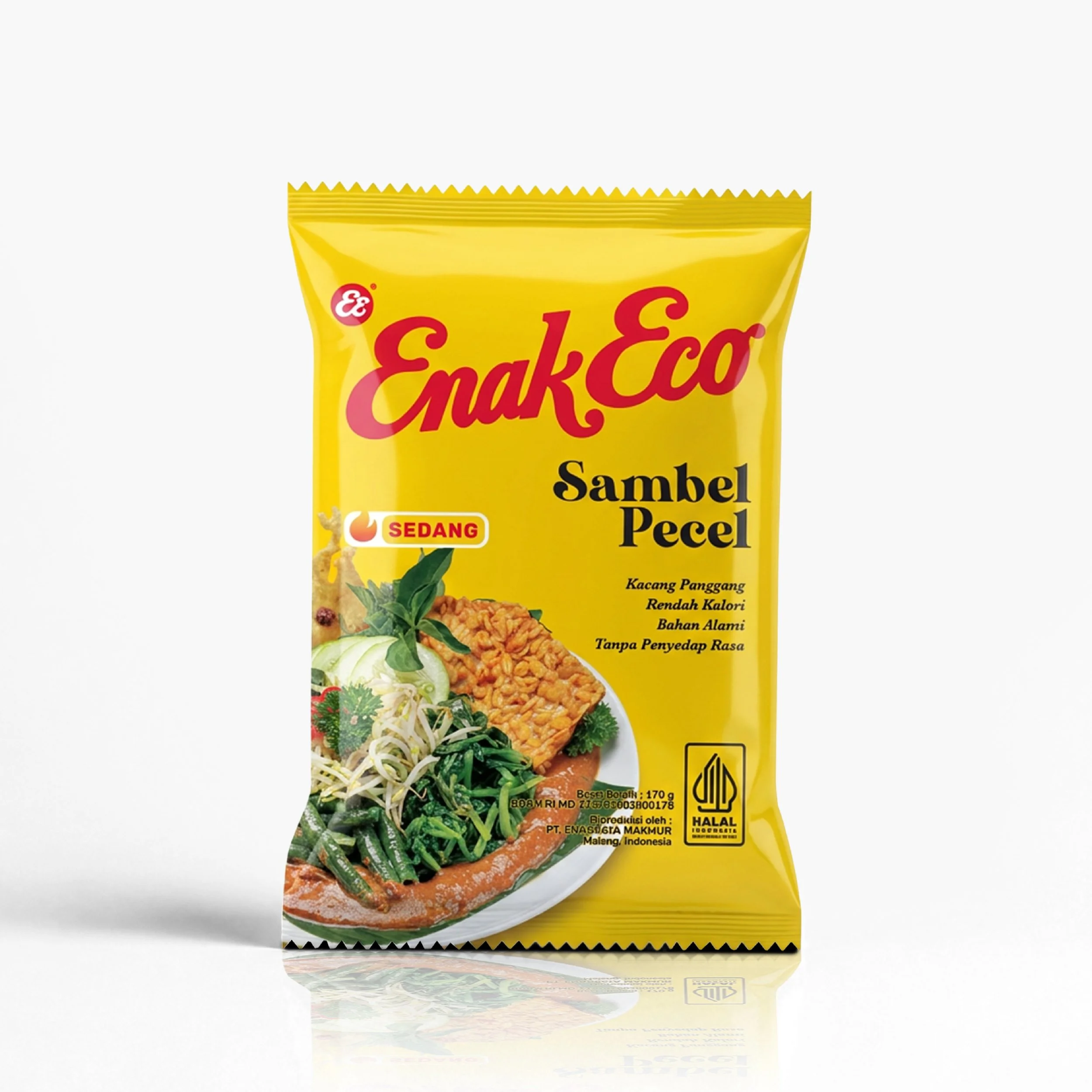
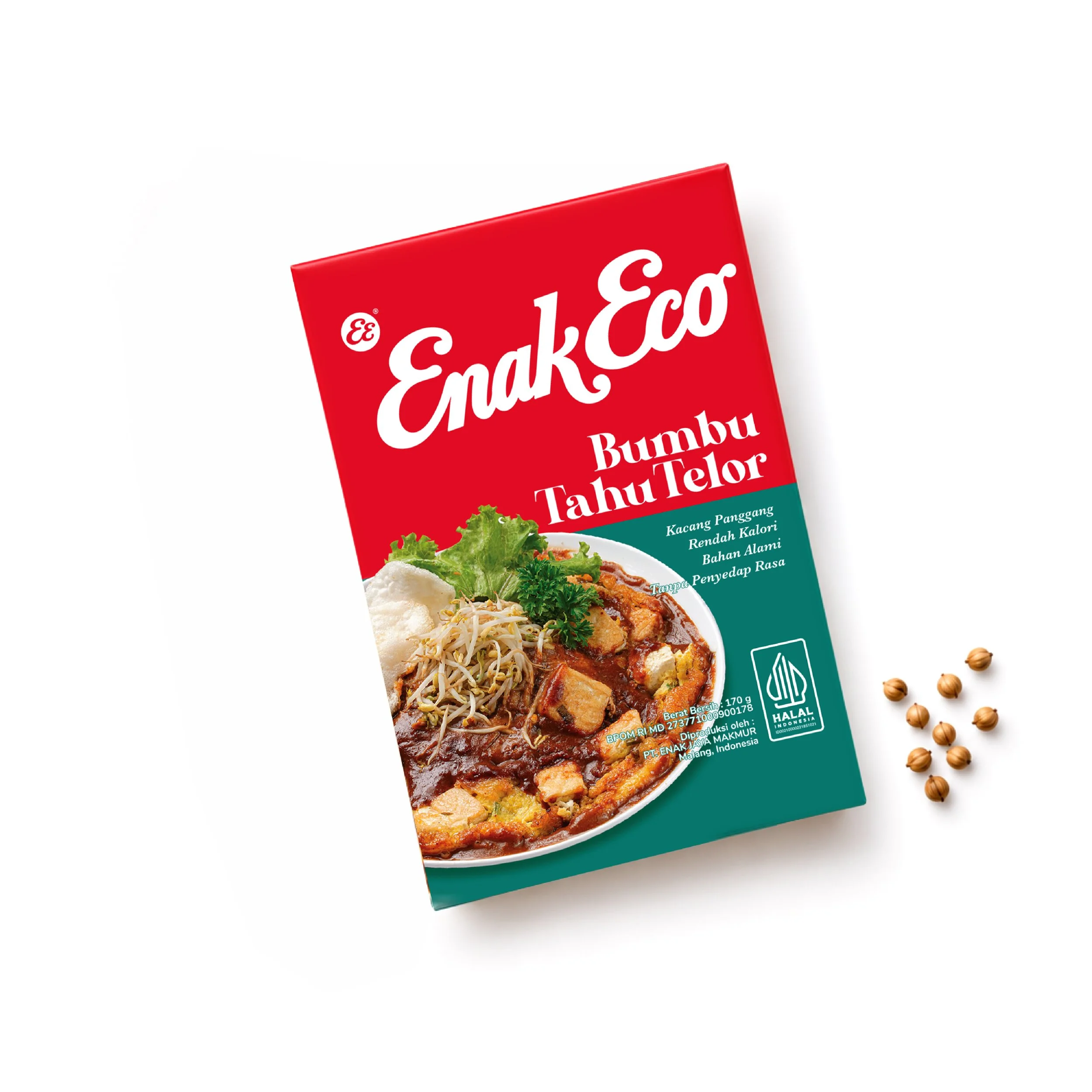
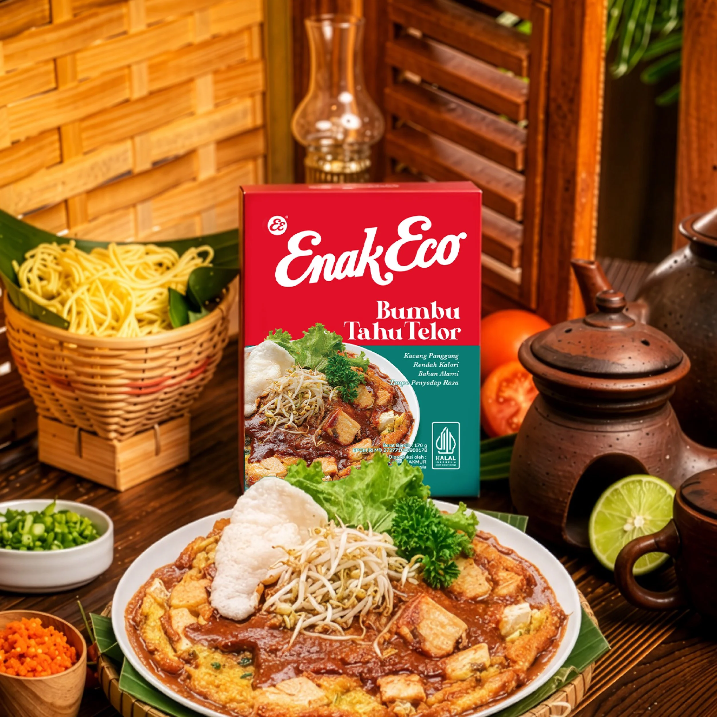
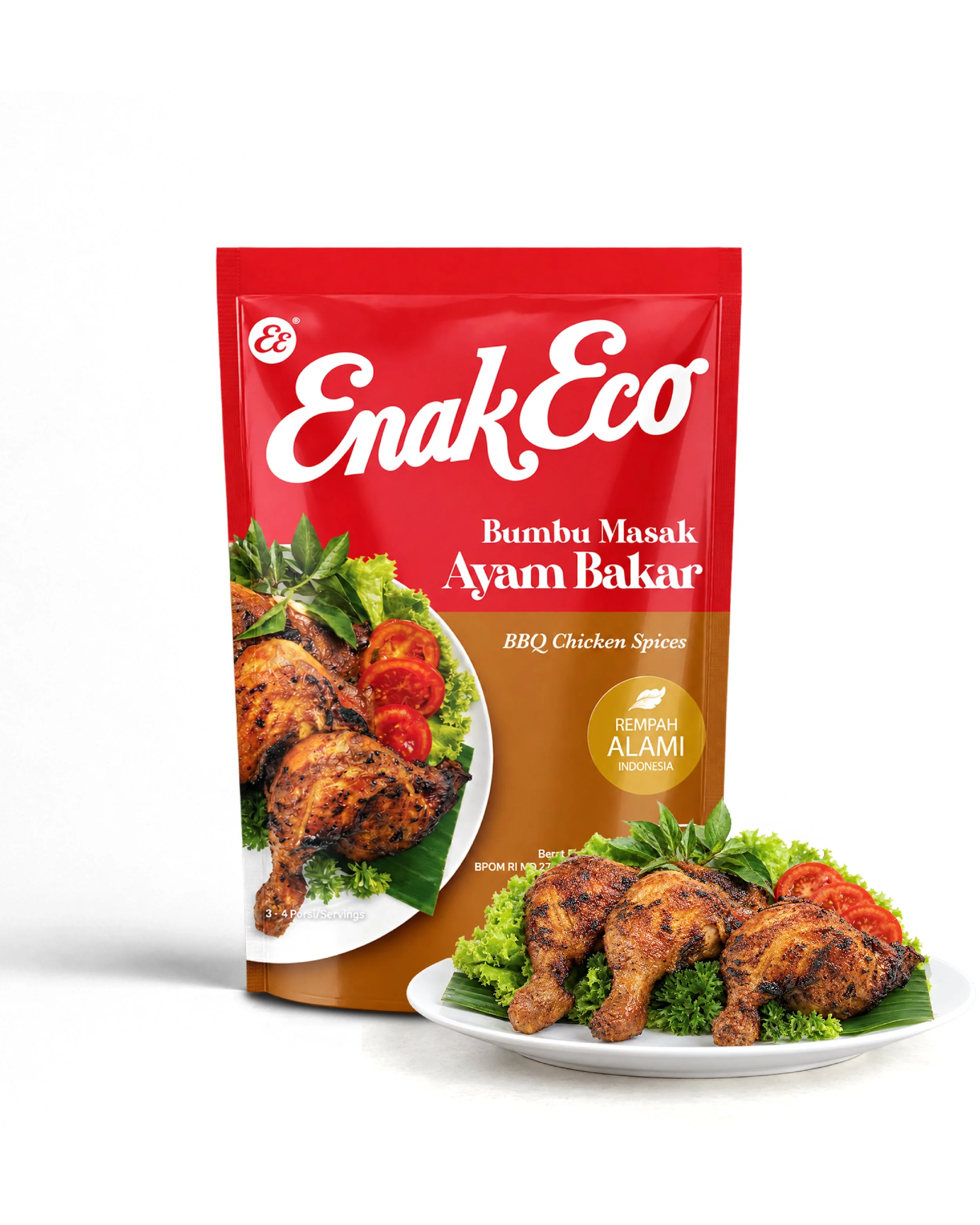
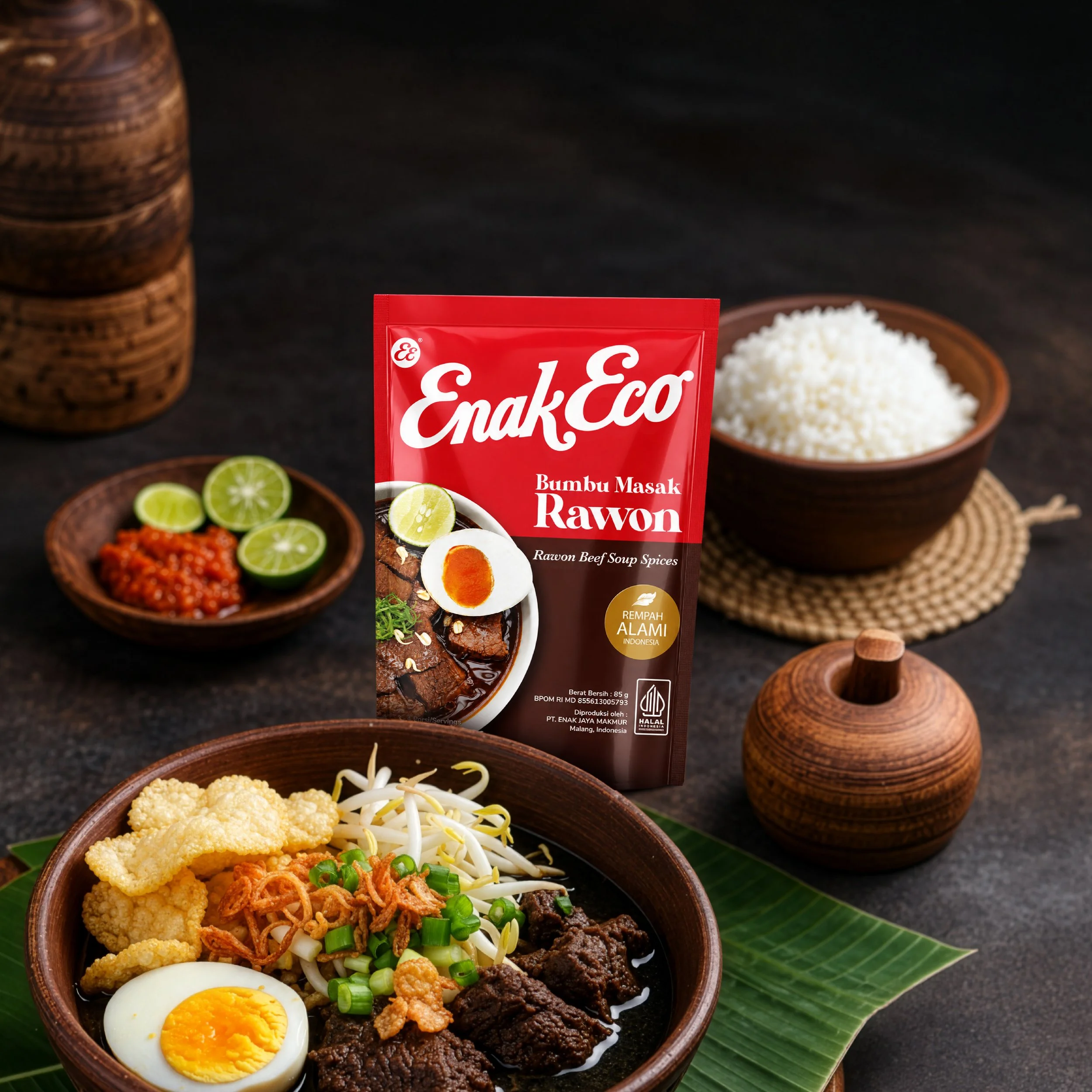
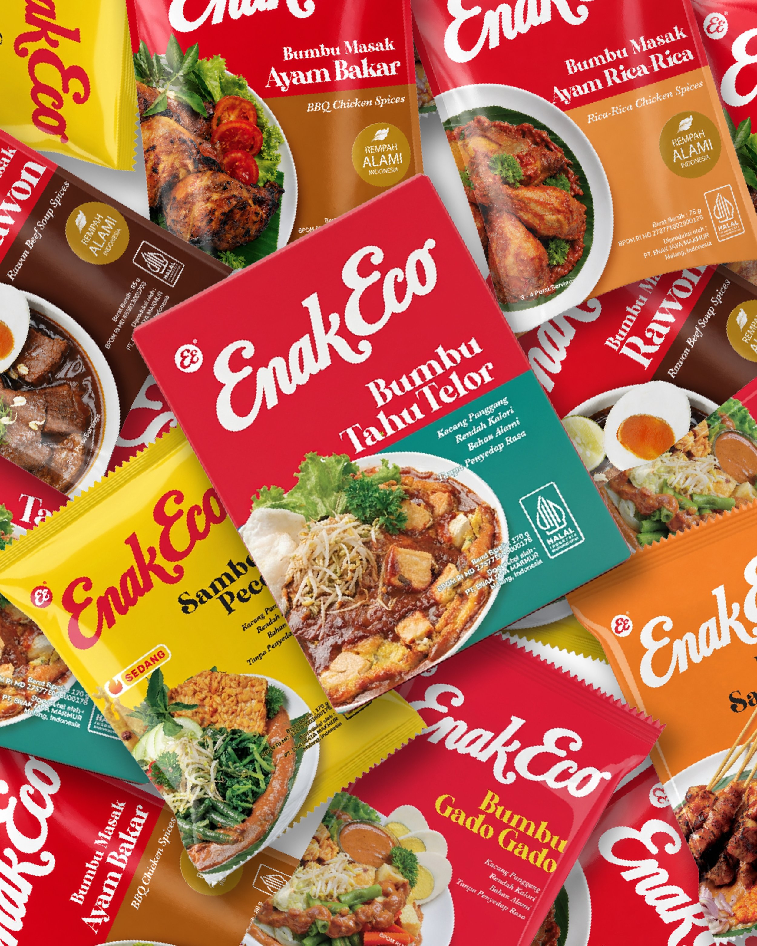
Komunikasia Cato Brand Partners rejuvenated the ENAK ECO brand identity and developed a clearer packaging system across its product portfolio. The work established ENAK ECO as the primary brand across its products, introduced a distinctive EE identity for the group and created a clearer distinction between peanut-based sambal and cooking pastes. The result is a more cohesive brand presence, designed to strengthen recognition and bring greater consistency to the portfolio.
The Challenge: A Strong Business Without a Brand to Match
ENAK ECO had the business capabilities and product range to stand alongside major players in the industry. Yet its brand identity and packaging did not fully communicate the strength of the business or the recognition it could command.
Across the portfolio, the relationship between the ENAK ECO brand and its individual products needed greater clarity. Product descriptions and category cues competed for attention, while the brand itself had an opportunity to play a stronger role in how consumers identified and remembered the products.
The challenge extended beyond individual packaging designs. ENAK ECO needed a more coherent brand structure that could connect its products under one recognisable name, while making the differences between its product categories easier to understand.
In a competitive cooking paste market, where products can be difficult to distinguish on shelf, a stronger brand identity could help ENAK ECO build on its authentic credentials and establish a more distinctive position.
The Objective: Build Recognition Around ENAK ECO
The ambition was to strengthen ENAK ECO as a recognisable brand across its portfolio, while retaining the familiarity and authenticity of its established products.
That meant three things:
Strengthen the master brand: Make ENAK ECO the most prominent and consistent identifier across the product range, building recognition beyond individual products and descriptions.
Clarify the portfolio: Establish a clearer distinction between peanut-based sambal and cooking pastes, helping consumers navigate the range and understand the role of each product.
Modernise without losing familiarity: Improve packaging clarity and visual consistency while retaining established colour assets that consumers could continue to recognise.
The Solution: A Rejuvenated Identity and a Clearer Packaging System
Komunikasia Cato Brand Partners rejuvenated the ENAK ECO brand identity and restructured the packaging system across its product portfolio. The work focused on strengthening the brand's visual presence, clarifying the relationship between the group and its products, and giving the packaging a more contemporary expression.
The work was structured around four priorities:
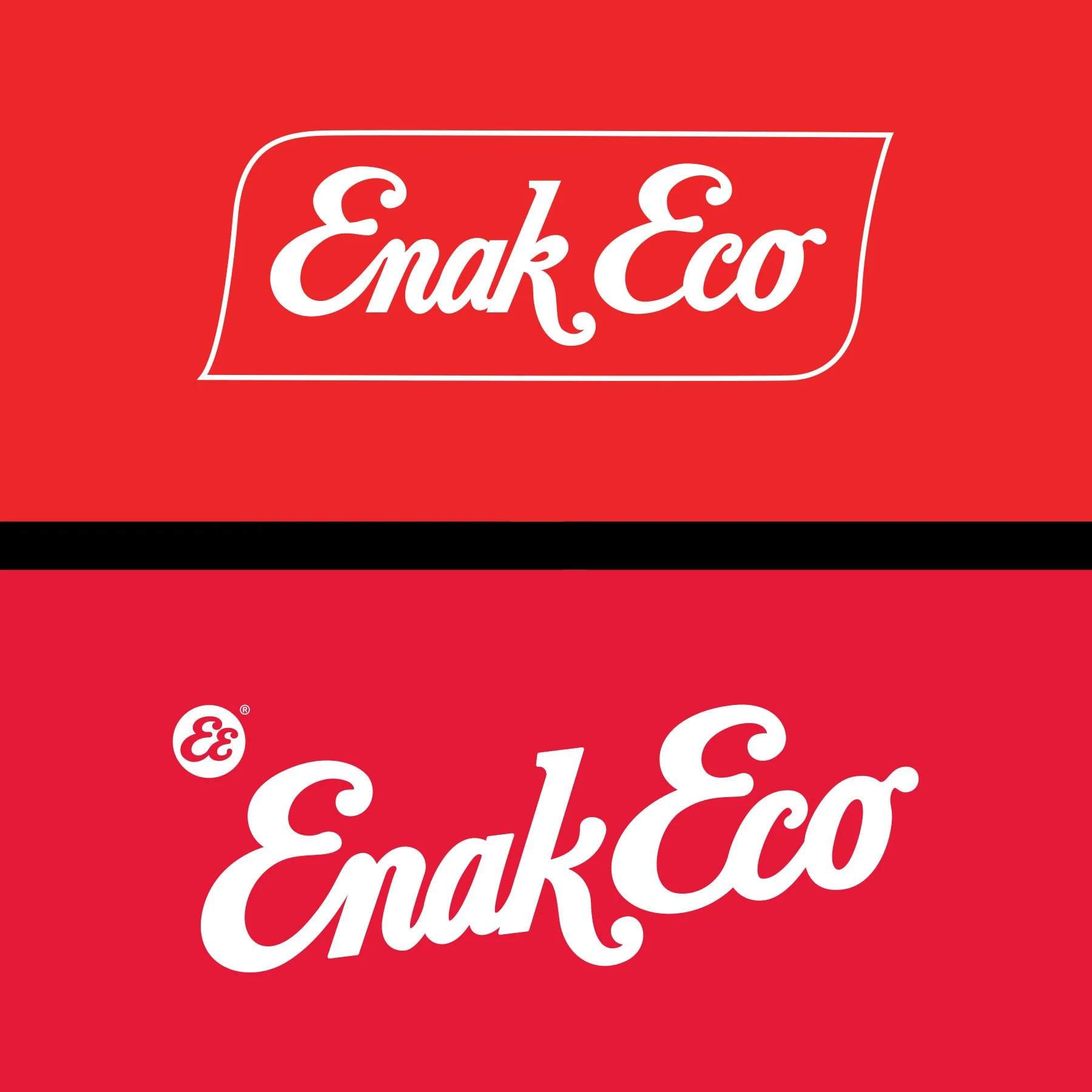
A rejuvenated ENAK ECO identity: Refined the logo to improve legibility, balance and visual clarity, creating a more contemporary identity while retaining the brand's established character.
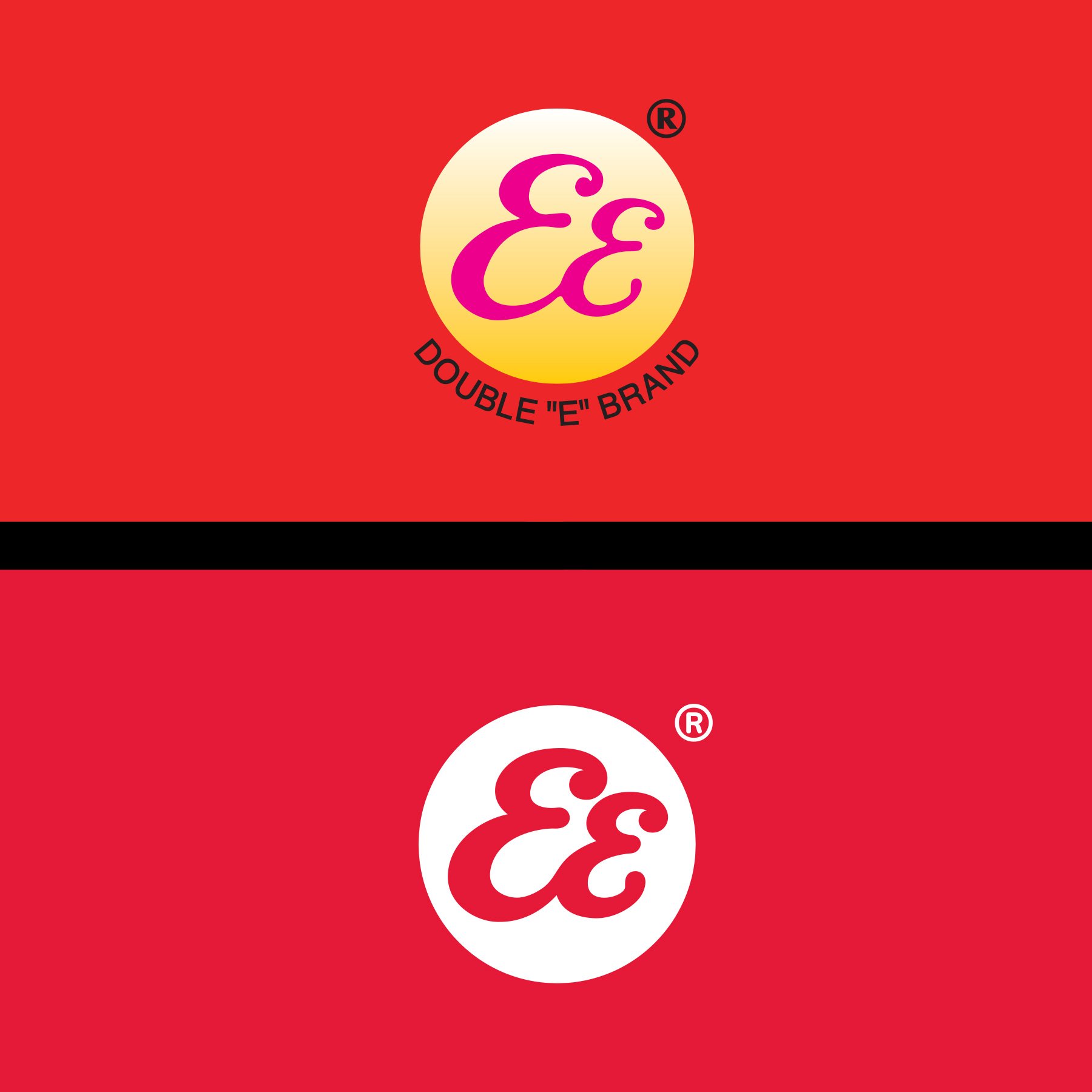
The EE group identity: Developed the double E (EE) as a distinctive holding identity for the group, providing a visual signature that could represent the wider business and support a more coherent brand structure.
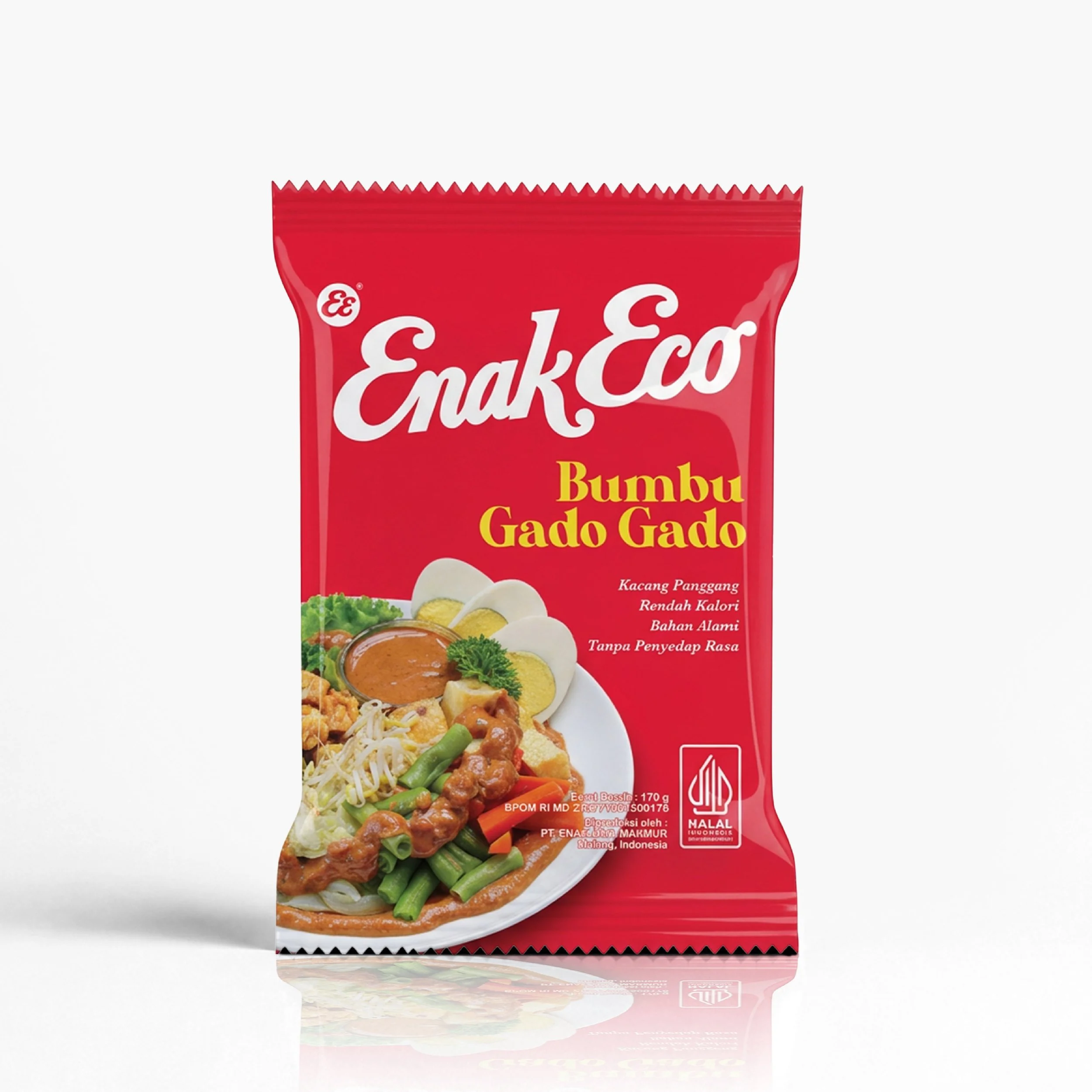
Brand-led packaging: Established ENAK ECO as the primary brand across the range, giving the brand name greater prominence and reducing the emphasis on generic product descriptions. The packaging now works harder to build recognition for ENAK ECO itself.
Clearer product categories: Created a more defined distinction between peanut-based sambal and cooking pastes. A cleaner layout and more structured visual hierarchy help consumers identify the product category while maintaining a consistent connection to ENAK ECO.
Colour remained an important part of the design approach. Rather than discarding familiar visual assets, the packaging retained recognisable colours and applied them within a cleaner, more consistent system. This brought a more modern expression to traditionally rooted products without losing their established market familiarity.
The Results: A More Recognisable Brand Across the Portfolio
The rejuvenated identity gives ENAK ECO a stronger and more consistent presence across its packaging. The brand name takes a more prominent position, helping establish a clearer visual connection between products and the business behind them.
The distinction between peanut-based sambal and cooking pastes is also more apparent, making the portfolio easier to navigate while giving each category a clearer role within the wider range.
Together, the identity and packaging work provide ENAK ECO with a stronger foundation for building brand recognition, reinforcing its authentic credentials and developing a more distinctive position in Indonesia's cooking paste market. The result is a portfolio in which ENAK ECO is easier to identify, more consistent across categories and better equipped to build lasting brand value.