Simba: Visual Evolution & Packaging Strategy for Market-Leading Cereal Brands
Maximizing Shelf Dominance in General Trade and Modern Trade Networks
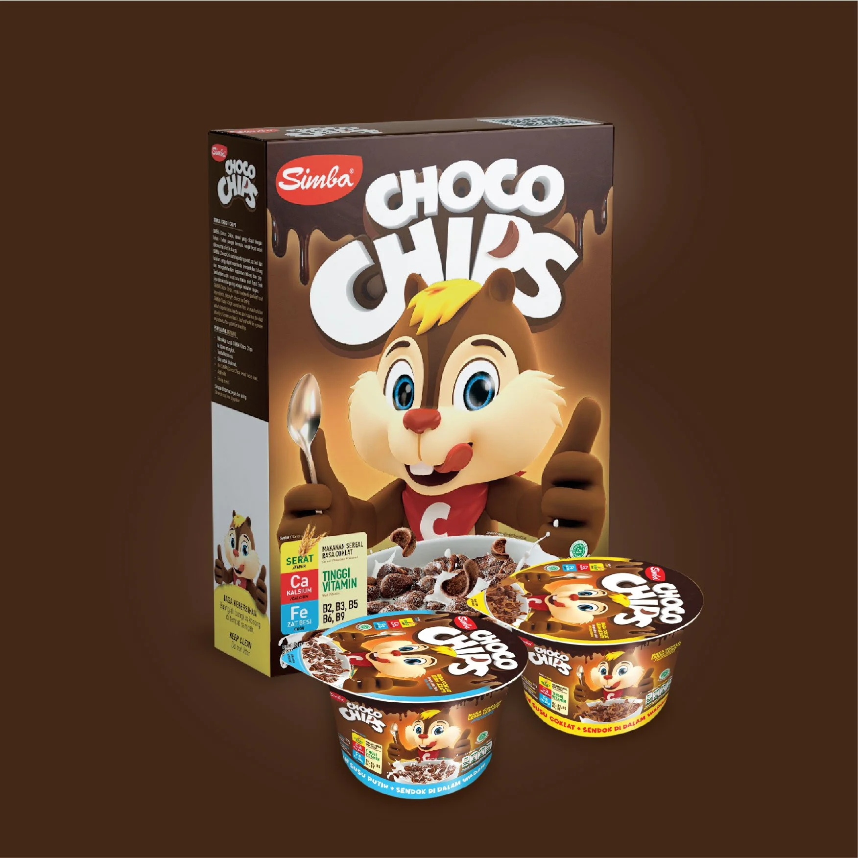
Komunikasia Cato Brand Partners redesigned the Simba Choco Chips packaging and evolved its chipmunk mascot so the brand could compete in two very different channels: the Indonesian warung and the supermarket cereal aisle. The new mascot-led packaging system, applied across the family box and single-serve cups, moved Simba into a premium-affordable position alongside international cereal brands while keeping it within reach of Indonesian families.
The Challenge: One Cereal Box, Two Very Different Shelves
Elevating Brand Mascots to Drive High Consumer Recall and Engagement
Simba Choco Chips is a chocolate cereal sold to Indonesian families through two very different channels: the neighbourhood warung and the supermarket aisle. Each one puts different pressure on the pack. In general trade, the box often sits half-hidden among dozens of other products and has a second or two to be recognised. In modern trade, it sits in a long cereal aisle next to international brands.
The existing packaging wasn’t built for either situation. The chipmunk mascot, the brand’s most recognisable asset, wasn’t doing enough work on the front of the pack, and the brand name, flavour and product cues didn’t read clearly from a distance. Across formats, the packs looked less like one brand than they should have.
The Objective: Make Simba Recognisable at a Glance in Both Channels
The brief was to give Simba Choco Chips packaging that works in both places: instantly recognisable when half-hidden on a crowded warung display, and credible enough to stand next to international cereal brands in modern trade, without pricing itself away from the Indonesian families who already buy it.
The Solution: Elevating the Chipmunk Mascot to Drive Recall at Shelf Distance
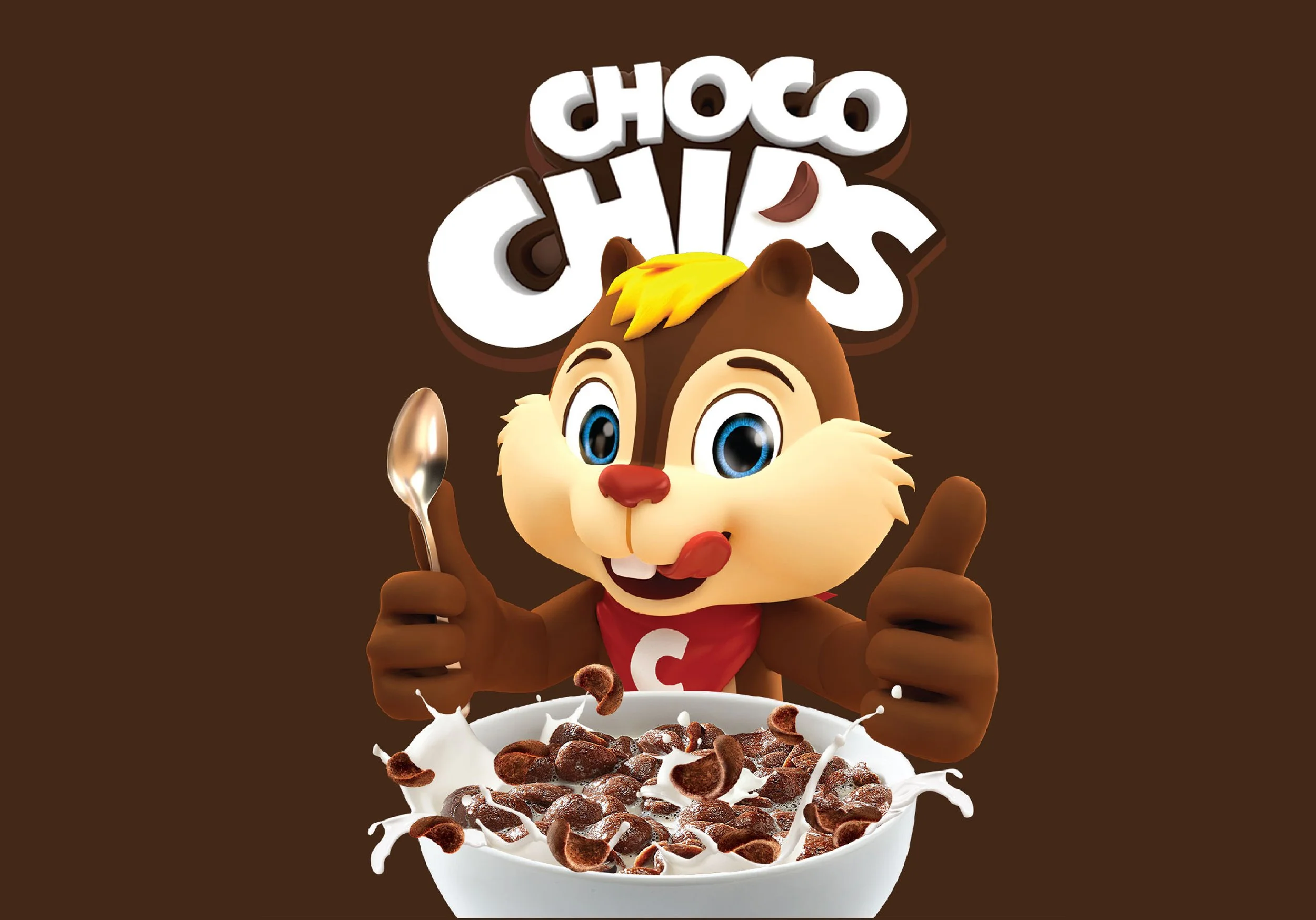
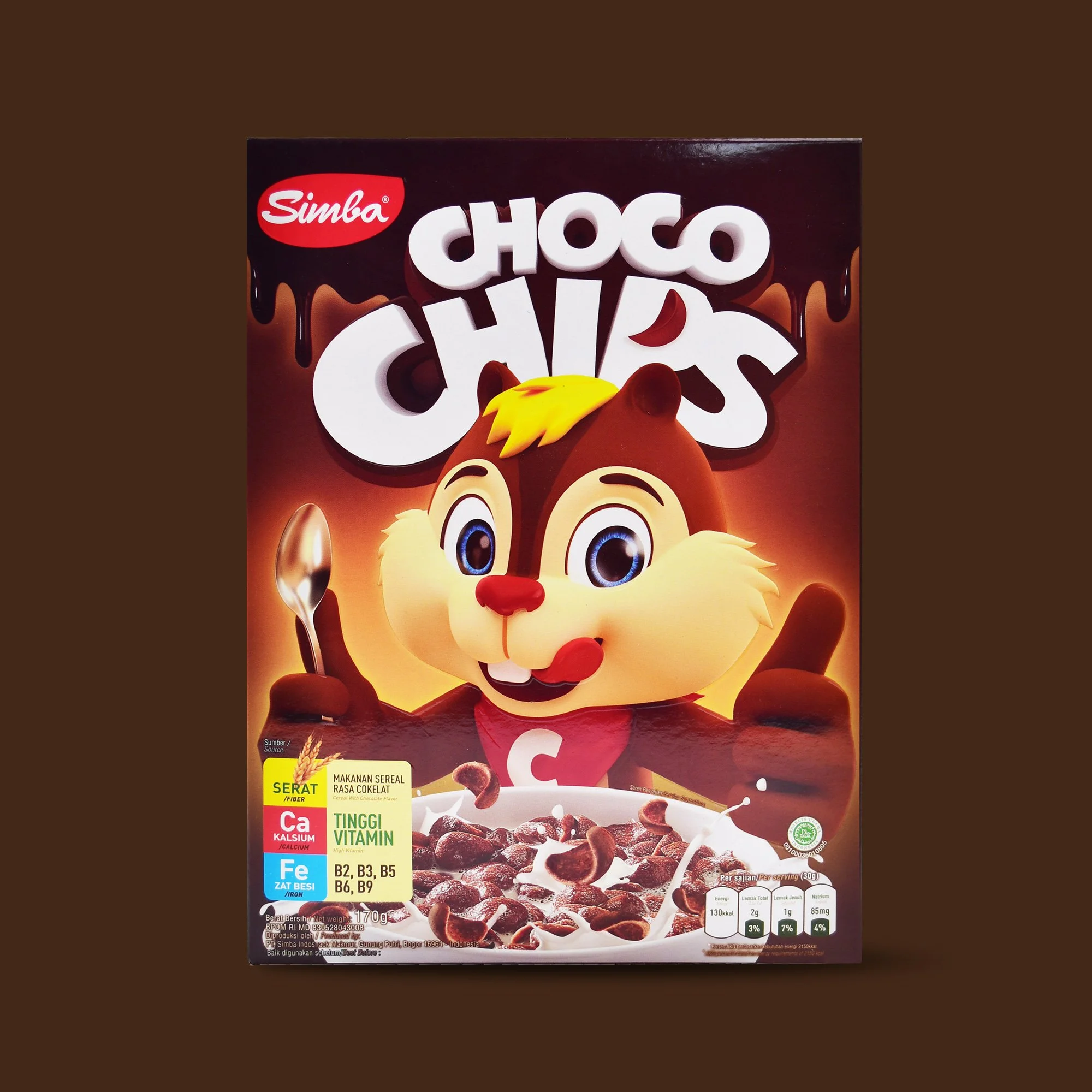
Komunikasia Cato Brand Partners redesigned the Simba Choco Chips packaging around the asset consumers already knew best: the chipmunk mascot. The character was made larger, more expressive and more central to the front of the pack, so the box can be spotted from a distance even when only part of it is visible.
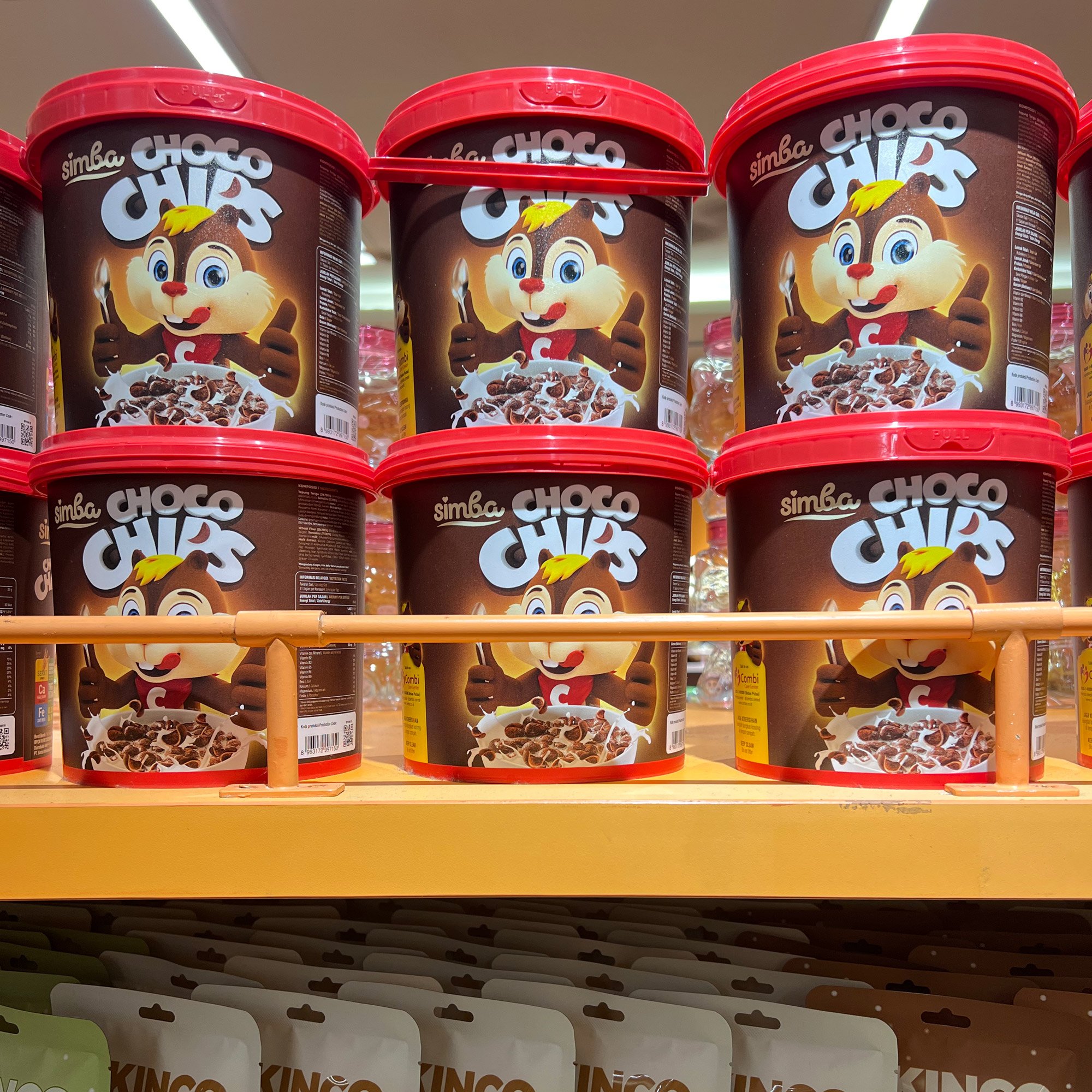
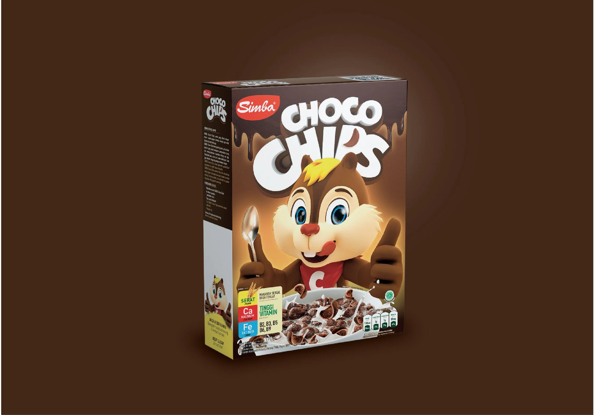
Around the mascot, the colour layout and graphic hierarchy were rebuilt so the brand name, flavour and product cues read in the right order at shelf distance. The same system carries across formats, from the family box to the single-serve cups, so every pack looks like part of one brand.
Mascot evolution: a bigger, more expressive chipmunk placed at the centre of the pack
Packaging system: one layout logic across the family box and single-serve cups
Two-channel shelf design: colour blocking and hierarchy built for both warung displays and supermarket aisles
A mascot is one of the most valuable assets a packaged food brand can own. Unlike a logo or a colour, a familiar character is recognised instantly by both children and parents, even at a glance and from a distance. For Simba, evolving the chipmunk rather than replacing it kept years of built-up recognition while making the character work harder on the shelf.
The Outcome: A Premium-Affordable Cereal Brand Ready for Modern Trade
The redesign gave Simba Choco Chips the shelf presence to compete in modern trade as well as in the warung. The brand moved into a premium-affordable position, sitting on supermarket shelves alongside international cereal brands while staying within reach of Indonesian families. The packaging system also gave the brand room to grow: Simba has since expanded into more SKUs and flavours strawberry, all built on the same mascot-led design.