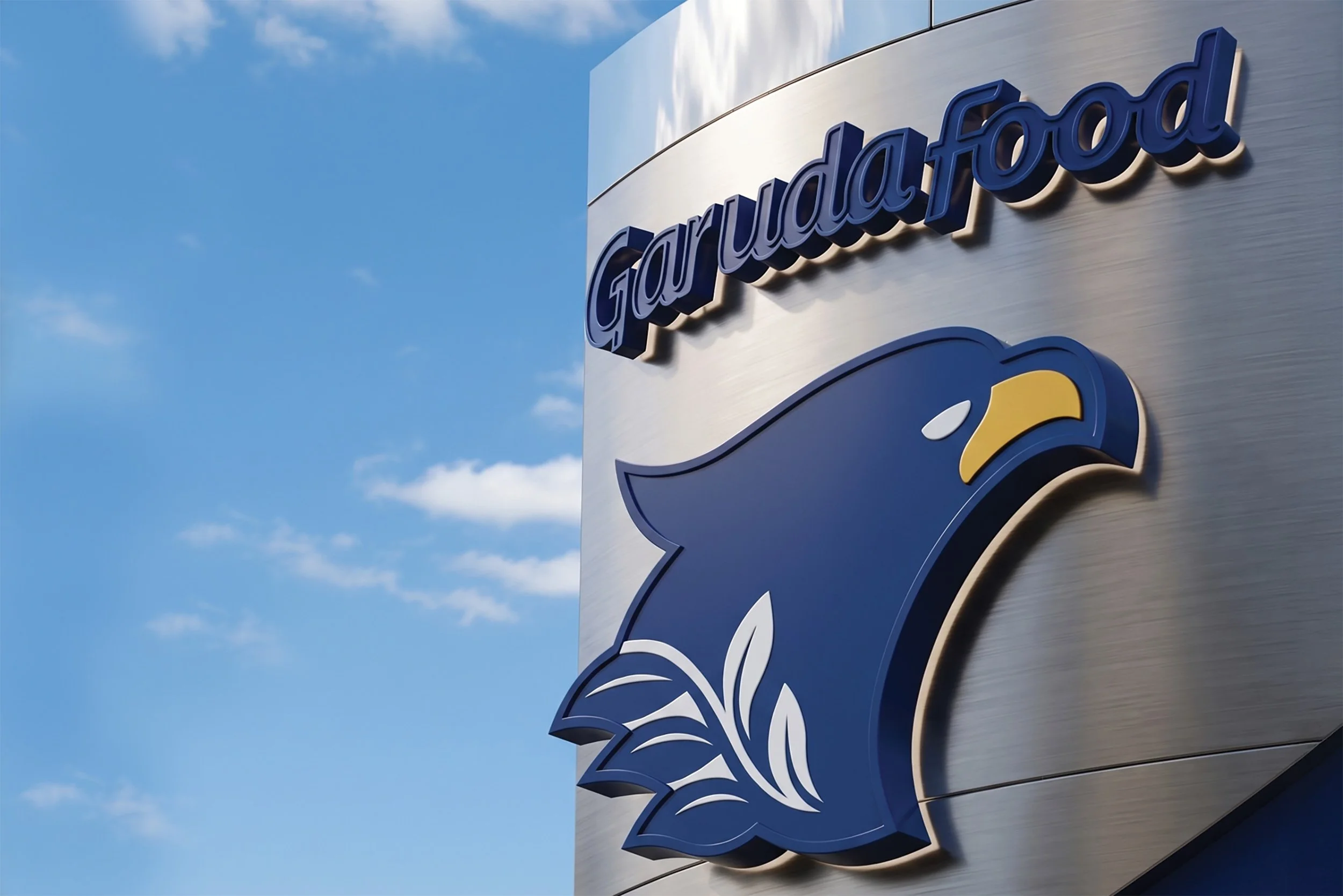
Garuda Food: From Warung to the World, Rebranding one of Indonesia’s Largest Snack Portfolios
Brand strategy, logo design and packaging design across Garuda, Gery, Chocolatos, SuperO2 and Clevo for modern trade and global export.
How Komunikasia Repositioned Garuda Food From a Peanut Brand to a Multi-Category Snack and Drinks Portfolio
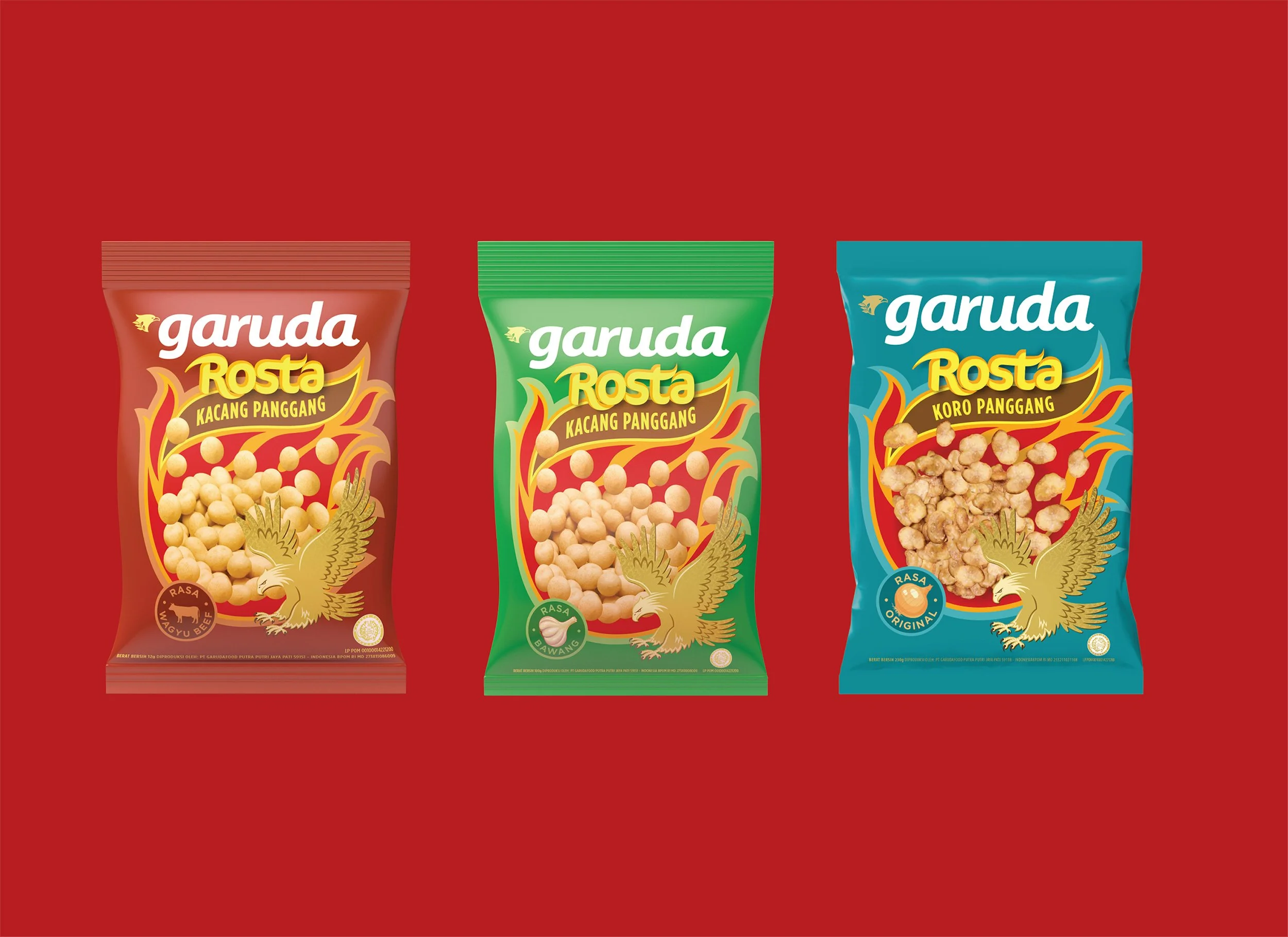
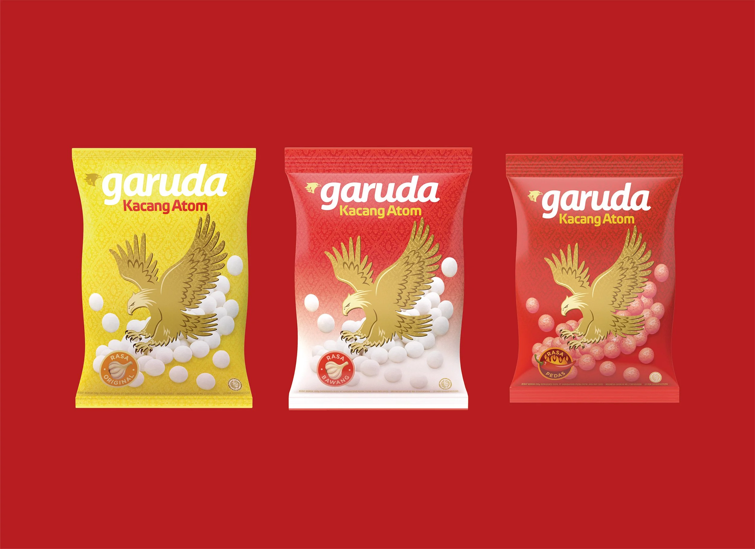
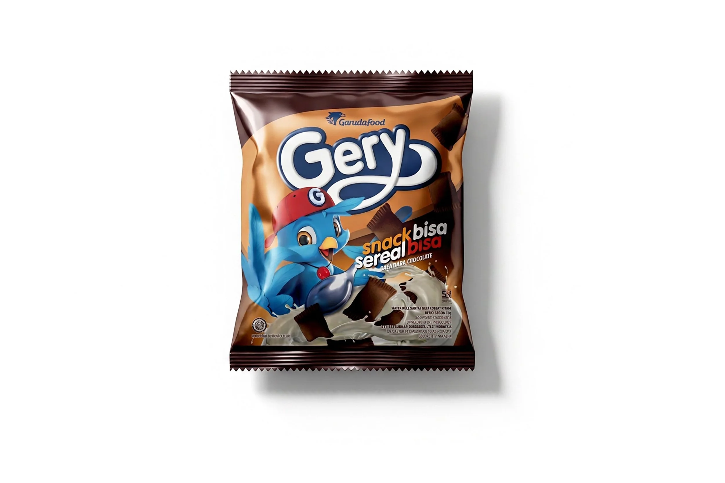
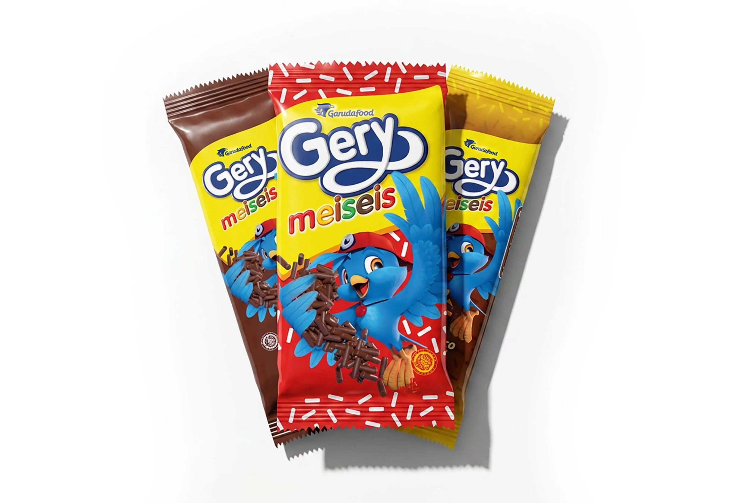
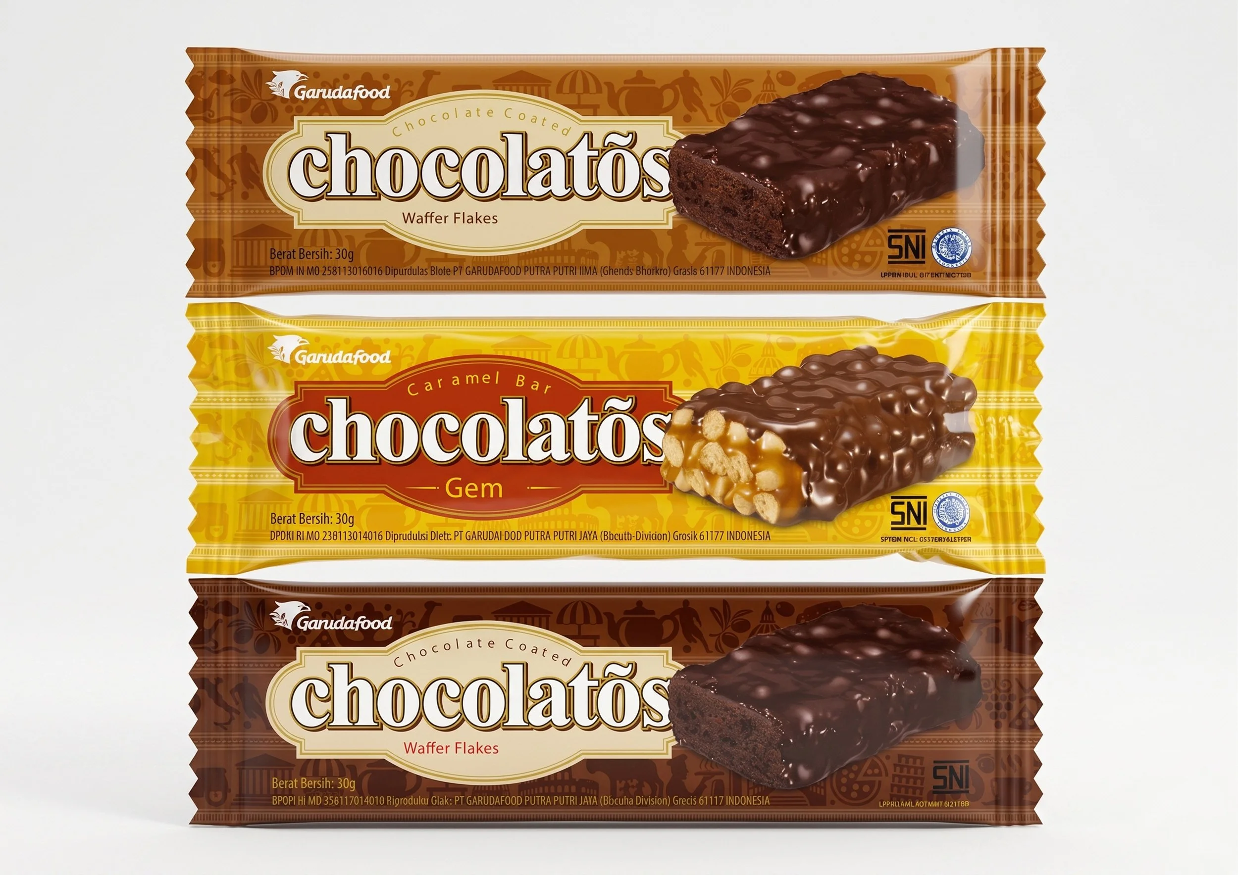
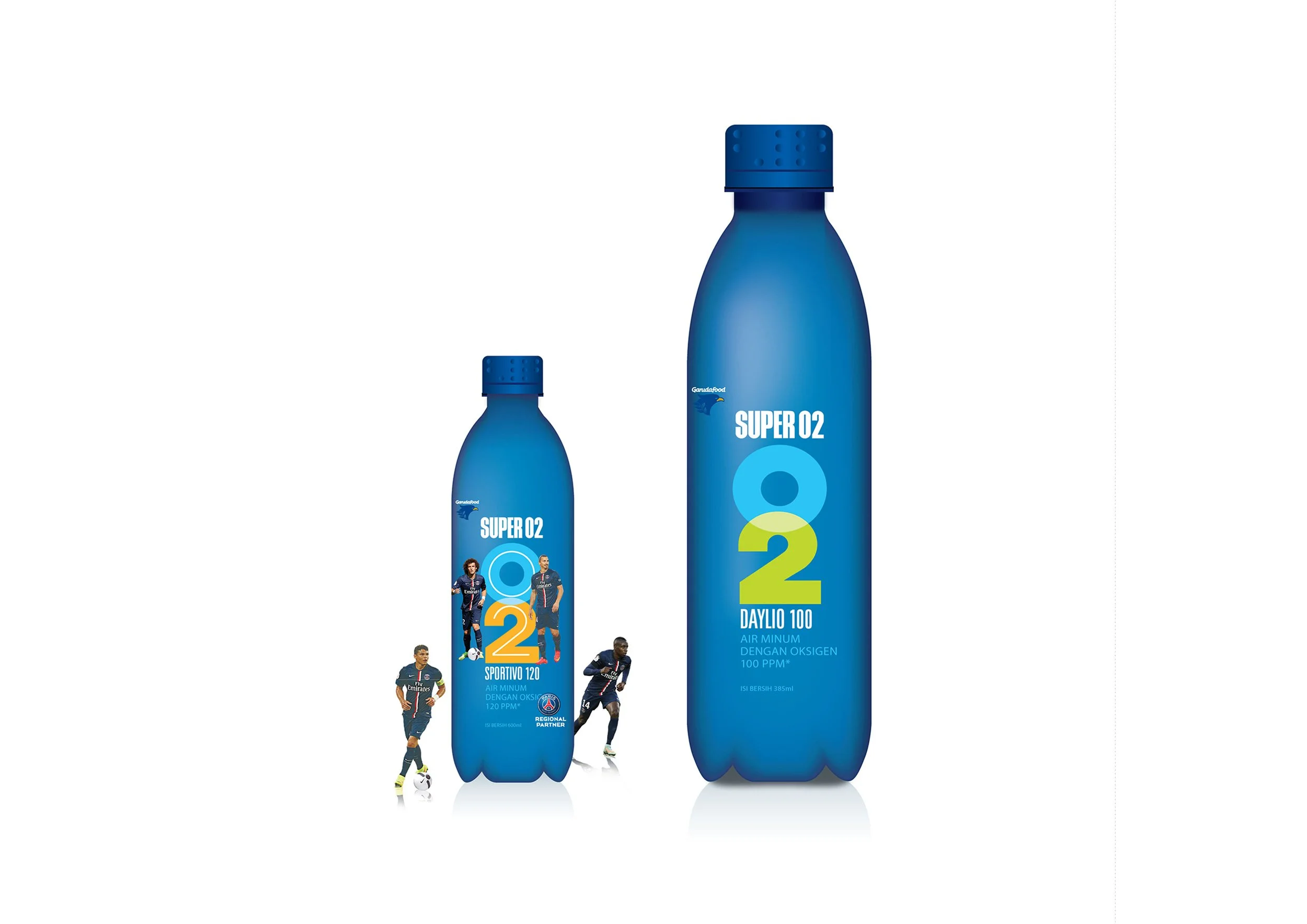
Komunikasia Cato Brand Partners developed the brand strategy, a new logo and the packaging system for the Garuda Food (Garudafood) portfolio, including Garuda, Gery, Chocolatos, SuperO2 and Clevo. The work moved Garuda Food from a warung-led peanut brand to a multi-category snack and drinks company, with packaging built for modern trade in Indonesia and retail markets across five continents.
The Challenge: A Warung-Built Portfolio Known Only for Peanuts
Garuda Food had built one of Indonesia’s most recognised snack portfolios on the back of the warung channel. That strength had become a ceiling.
The brand’s equity was real but narrow: most Indonesians associated Garuda with peanuts, full stop. That association had served the business well in traditional trade, but it limited how far the Garuda name could stretch. Every new category launched under it had to work against a single, deeply fixed perception.
The sub-brands carried a second problem. Gery, Chocolatos, SuperO2 and Clevo each had their own visual logic, developed separately and for different consumers. On a warung shelf that mattered less. In modern trade it mattered a great deal: the products read as separate companies rather than one portfolio, and they gained nothing from the scale and credibility of the business behind them.
That fragmentation also limited the portfolio internationally. A visual system that had grown up around one channel in one country was not built to command shelf space in supermarkets abroad, where Garuda Food had no existing recognition to rely on.
The Objective: Move Upmarket Without Losing the Mass Consumer Base
The ambition was clear, but it held a tension. Garuda Food needed to move upmarket without abandoning the mass consumer base that had built the business.
That meant three things at once:
Raise perceived value for modern trade and younger urban buyers, without signalling to existing consumers that the brand had moved out of their reach.
Earn relevance with millennial and Gen Z buyers, who choose on lifestyle fit as much as on price.
Build packaging robust enough to travel, competing on retail shelves across Southeast Asia, Africa, Europe, Oceania and North America.
The Solution: A New Garuda Food Logo and One Packaging System Across the Portfolio
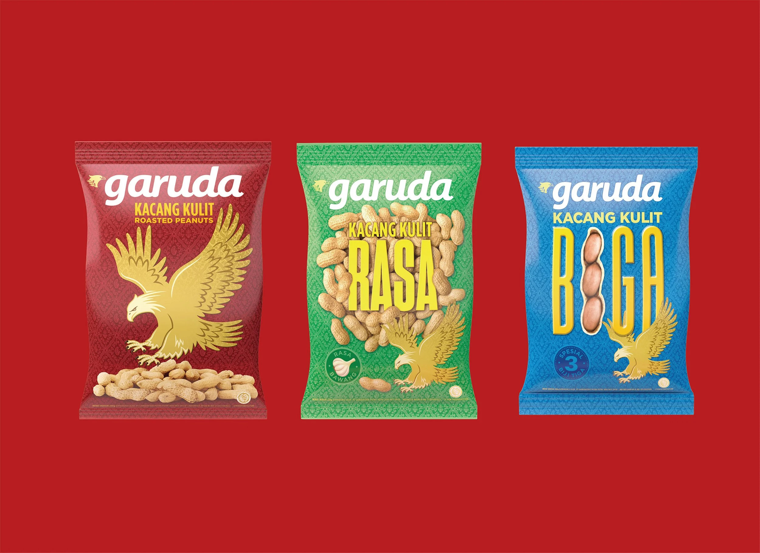
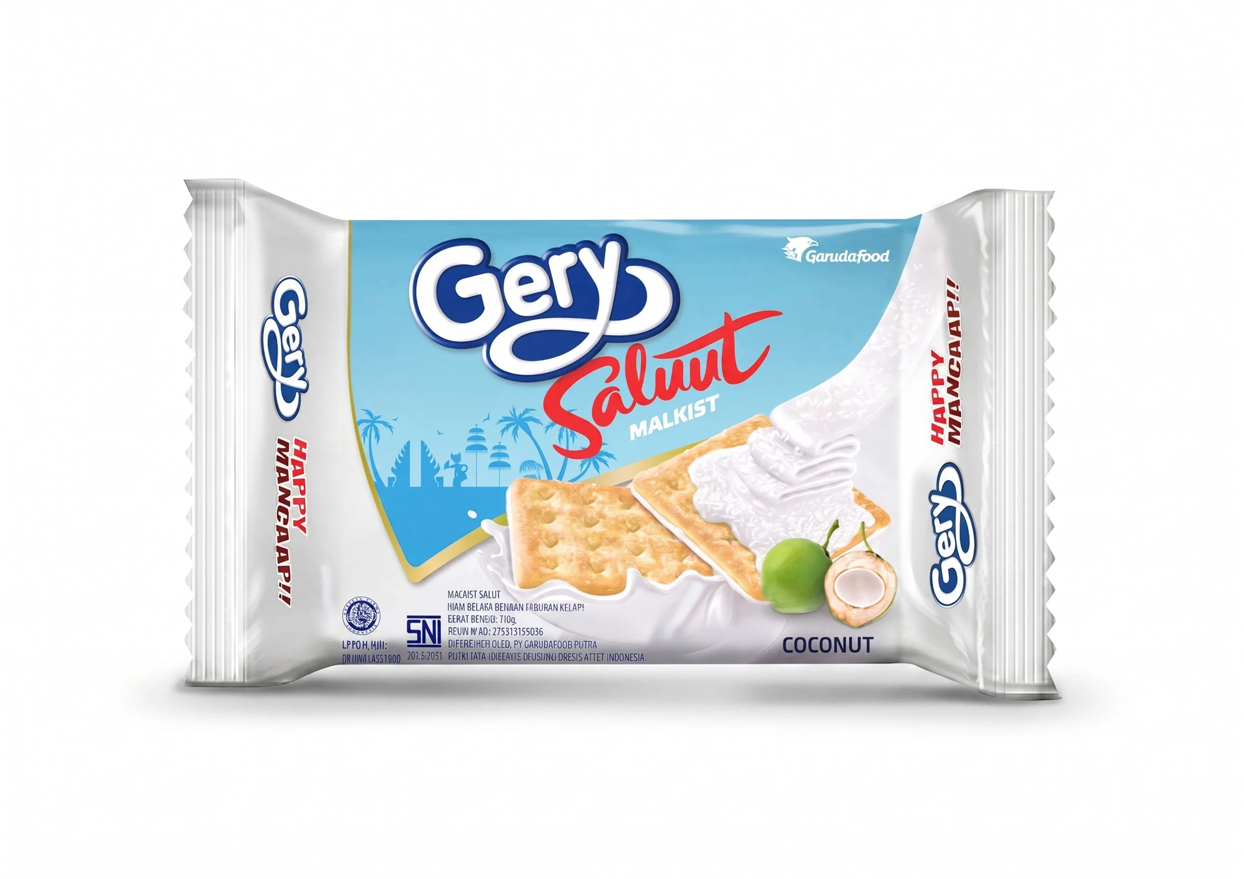
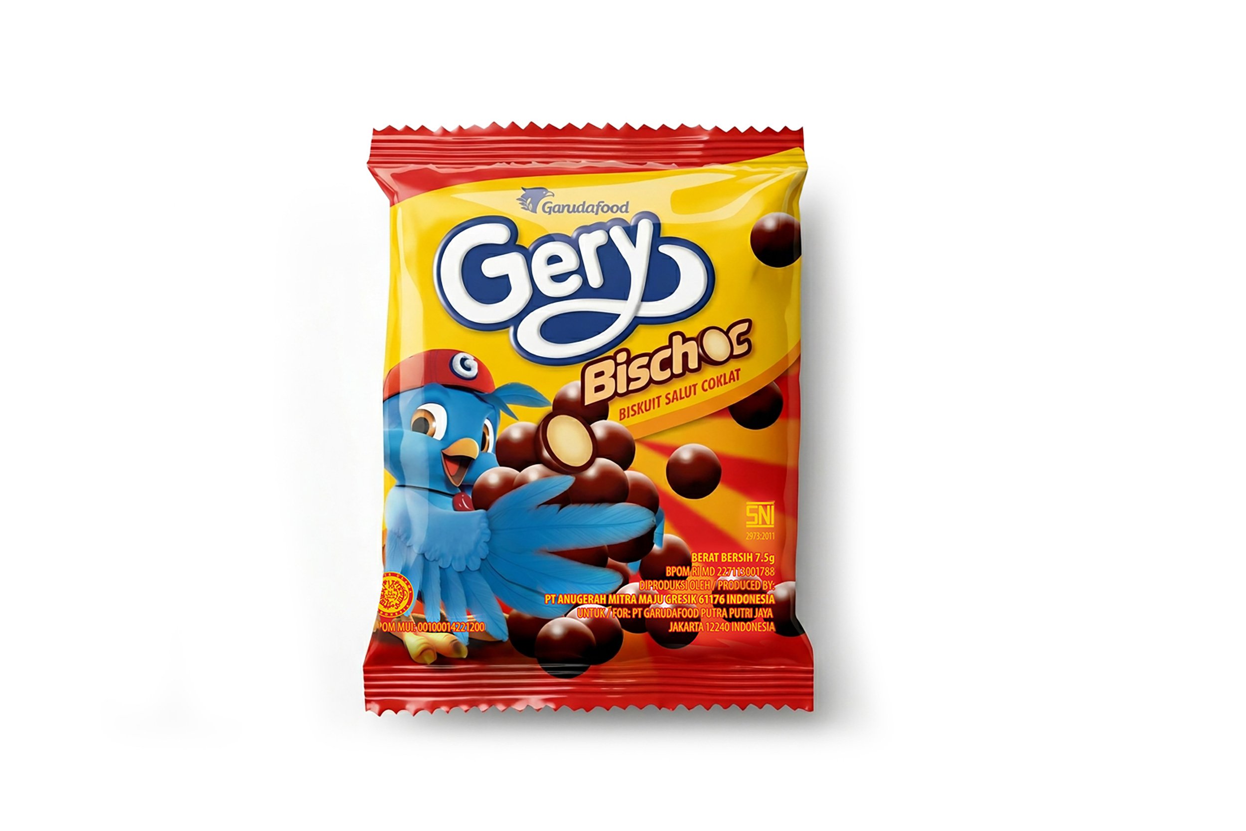
Komunikasia Cato Brand Partners developed the brand strategy, the Garuda Food logo and the full packaging system across the portfolio. The core challenge was architectural: five product lines, Garuda Kacang, Gery Biscuit, Chocolatos, SuperO2 and Clevo, each with different equities and different consumer relationships, needed a unified visual language. Each brand had to keep its own identity while reading as part of a coherent, modern family.
The work was structured around five priorities:
Repositioning the master brand: Garuda could no longer be the peanut brand. The strategy repositioned it as Indonesia’s snack and drinks company, giving the name room to carry categories well beyond peanuts.
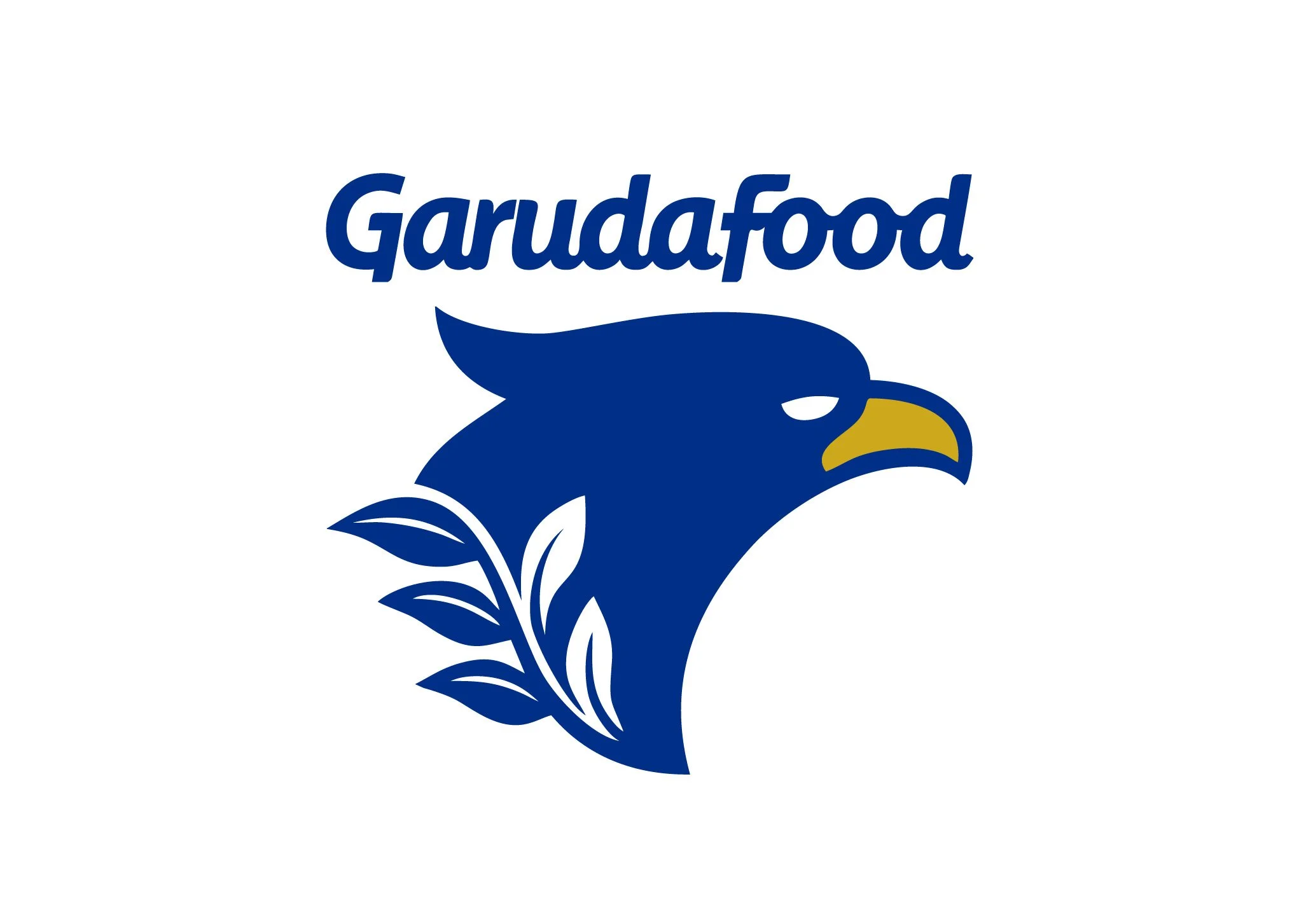
A new Garuda Food logo: Designed a logo that could represent a multi-category company rather than a single product, and work across modern trade shelves, export packaging and corporate use.
Portfolio architecture: Defined the relationship between Garuda Food and its sub-brands, so that Gery, Chocolatos, SuperO2 and Clevo kept their individual personalities while drawing on the strength of the parent company.
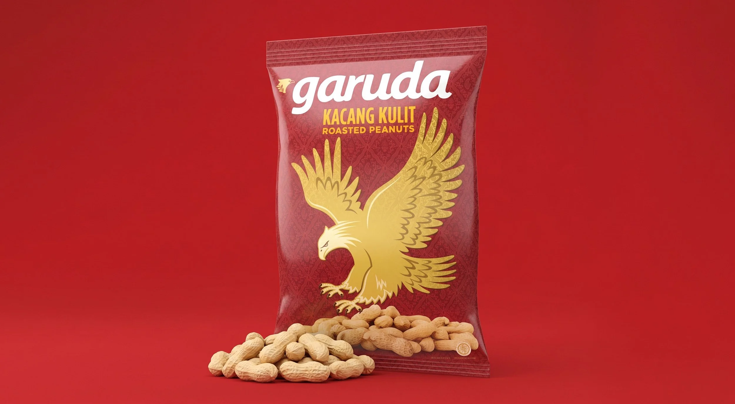
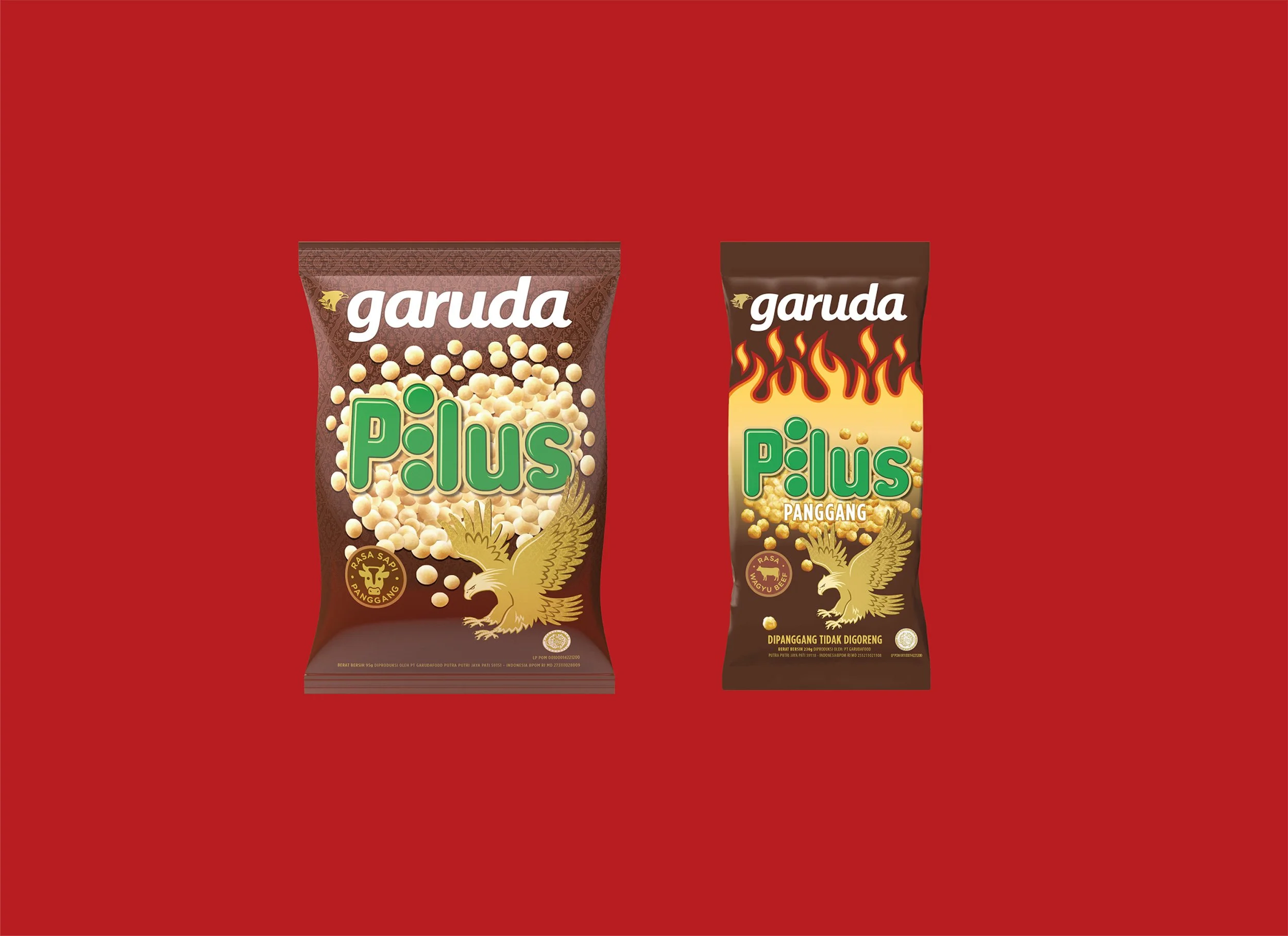
A unified packaging system: Created a shared visual language across the portfolio, so the products read as one family on the shelf and could hold a stronger, more organised presence in modern trade.
Export-ready design: Built the system to work across modern trade formats in Indonesia and in export markets including Vietnam, Malaysia, Thailand, the Philippines, Myanmar, Brunei, West Africa, the Netherlands, the UK, Australia and the United States.
That range demands more than an aesthetic refresh. Regulatory requirements, retail shelf formats and how consumers read packaging differ significantly across those markets, and the logo and packaging system had to hold up in all of them.
The Results: From Warung Shelves to Modern Trade and Export Markets
Garuda Food expanded distribution from traditional trade into modern trade channels across Indonesia and gained retail listings in markets across Southeast Asia, Africa, Europe, Oceania and North America.
Consumer perception shifted as well. Garuda moved from being seen as a single-category peanut brand to being recognised as a multi-category snack and drinks portfolio, positioned for relevance with millennial and Gen Z buyers.
The portfolio now works as one family under the Garuda Food logo. Each sub-brand keeps its own identity while reinforcing the others, giving Garuda Food a brand structure built for both the warung and the world.