Propan: Building Indonesia's Leading Decorative Paint Brand from a Varnish Equity
Brand strategy, corporate branding identity, packaging design and a nationwide campaign for a category expansion into premium decorative paints.
How Komunikasia Moved Propan From Varnish Leader to Premium Decorative Paint Brand
Komunikasia Cato Brand Partners developed the brand strategy, corporate identity, packaging system and nationwide campaign that took Propan from wood varnish, where its Impra brand was the household name, into premium decorative paint. The work built the brand around a single corporate colour, Propan Purple, and two campaign lines, “Think Paint, Think Propan” and “Cari Cat, Cari Propan.”
The Challenge: The Leader in Varnish, Invisible in Decorative Paint
Propan had a problem that most brands would envy and none would want. In wood varnish, the company dominated: its Impra brand was the household name, the category default, the product Indonesians reached for without thinking. That trust ran deep with professional painters, contractors and trade buyers as well as with consumers.
In decorative paint, Propan barely existed in the consumer’s mind. The category was owned by Dulux, Jotun and Nippon. Propan made paint. Nobody knew.
The equity that existed sat with Impra, not with Propan. Consumers trusted the varnish, not the company behind it, so none of that trust carried over when Propan put its name on a can of wall paint.
The Objective: Turn Varnish Trust Into a Premium Paint Brand
The strategic task was to transfer Impra’s hard-won trust in varnish to Propan as a master brand, then use that corporate credibility to enter and compete in decorative paint. That category had established foreign competitors and strong consumer loyalty to existing names.
The entry point had to be premium. A direct price fight against mass-market paint brands would have stripped away the equity Propan carried from the professional and trade segment, and positioned it as one more cheap alternative in a crowded category.
The Solution: One Colour, Propan Purple, Across Every Pack and Touchpoint
Komunikasia Cato Brand Partners developed the full brand strategy, corporate identity, packaging system and campaign concept.
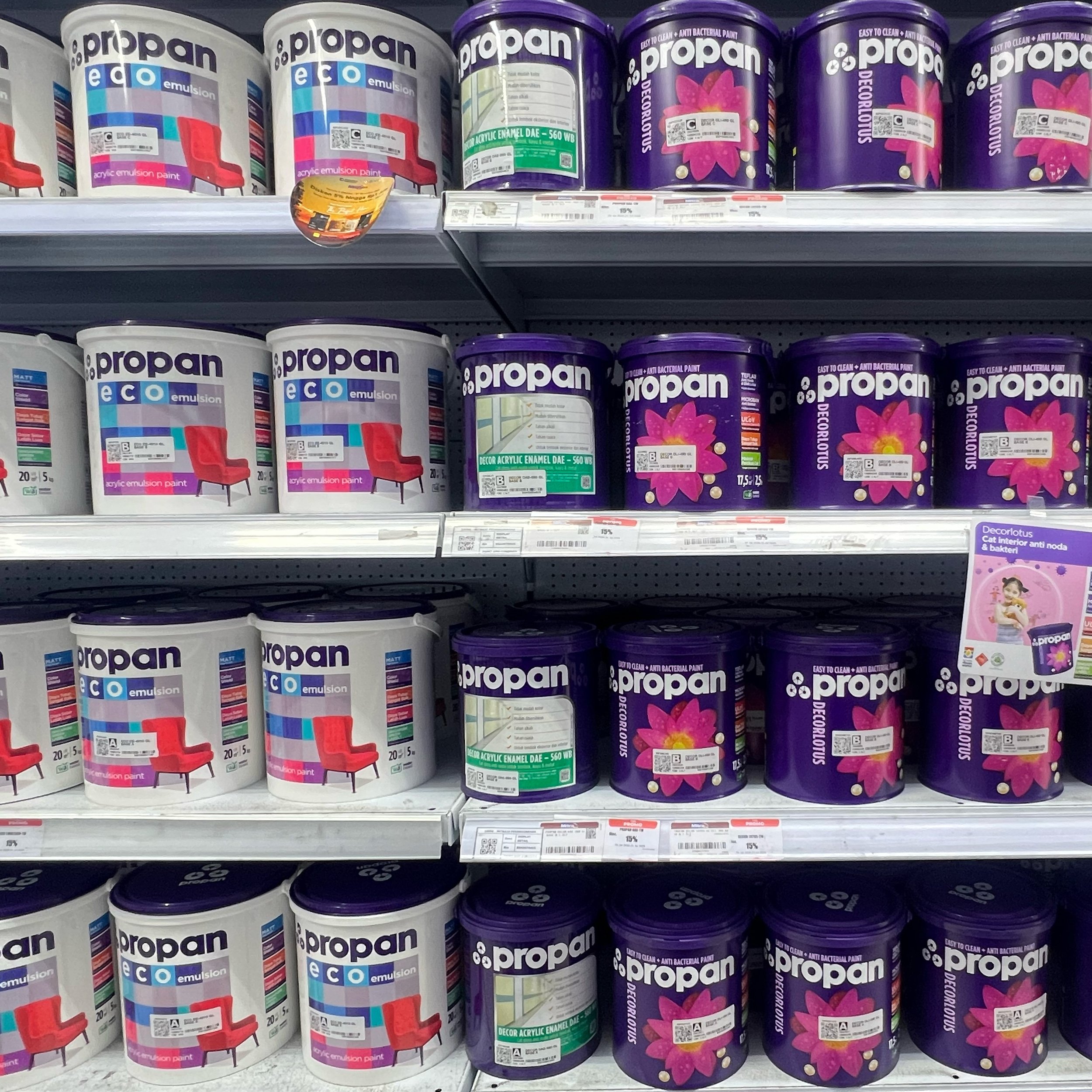
The identity decision was deliberate: one colour, Propan Purple, anchored across every product line, every pack and every touchpoint. In hardware stores and paint shops, competing brands fight for shelf recognition through colour-coding and sub-brand proliferation. In that environment, a single dominant corporate colour builds recognition faster than any logo.
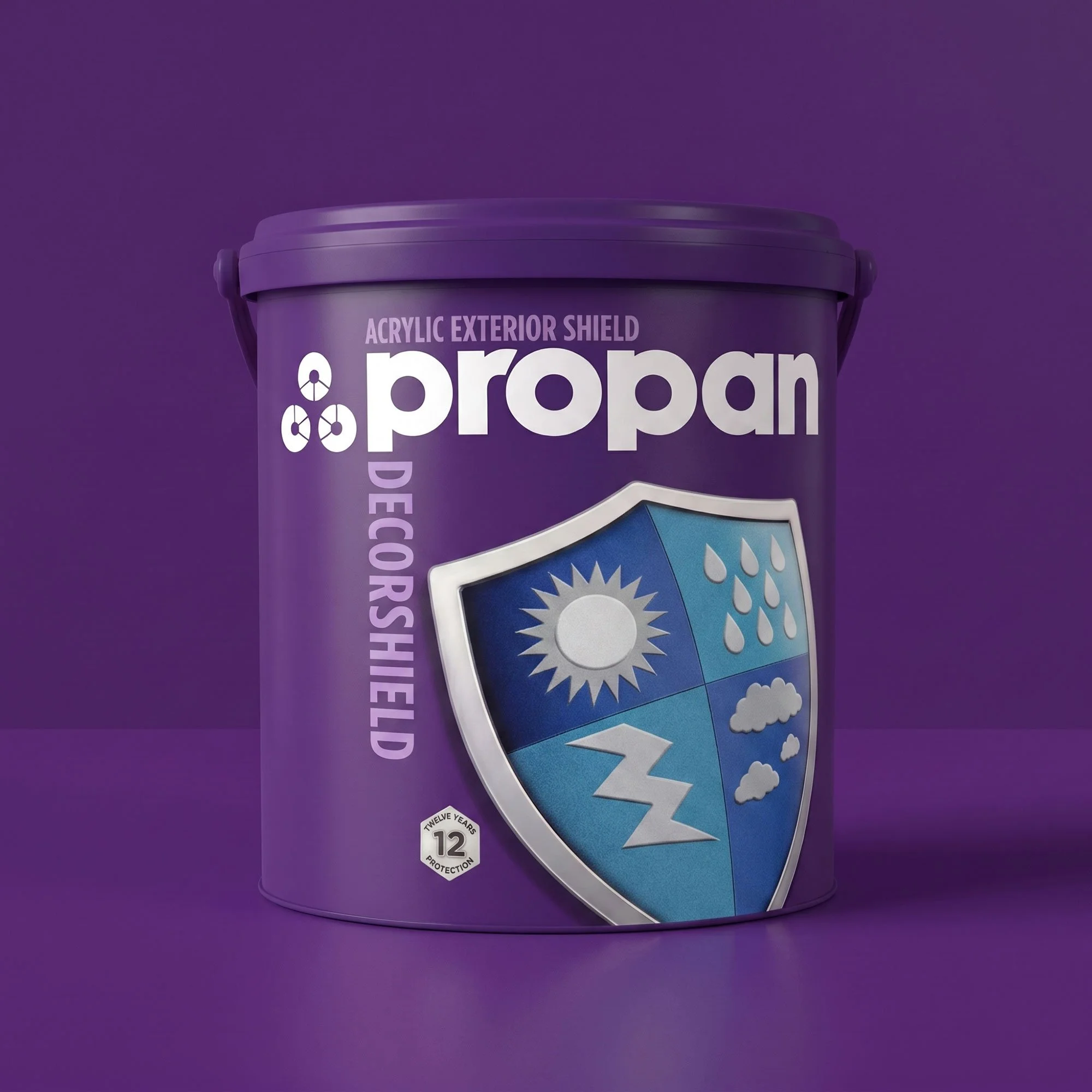
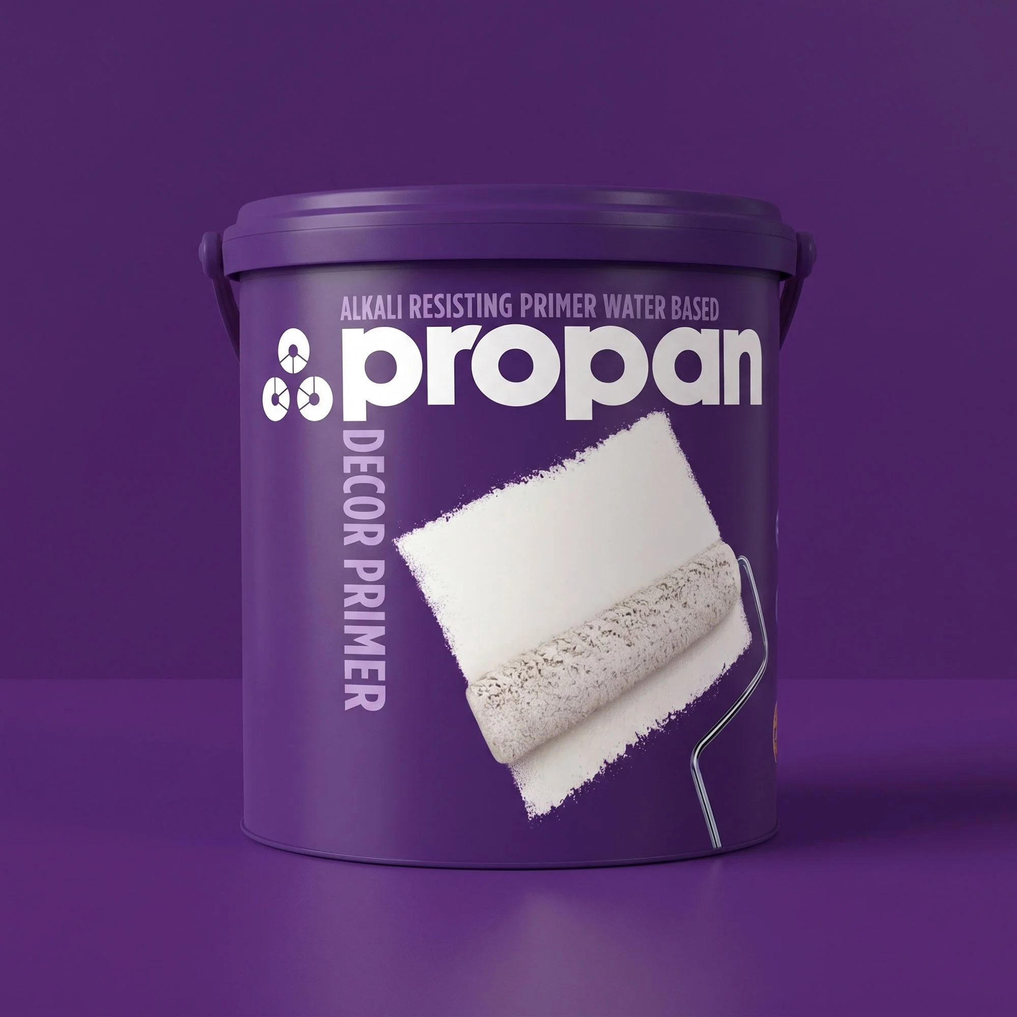
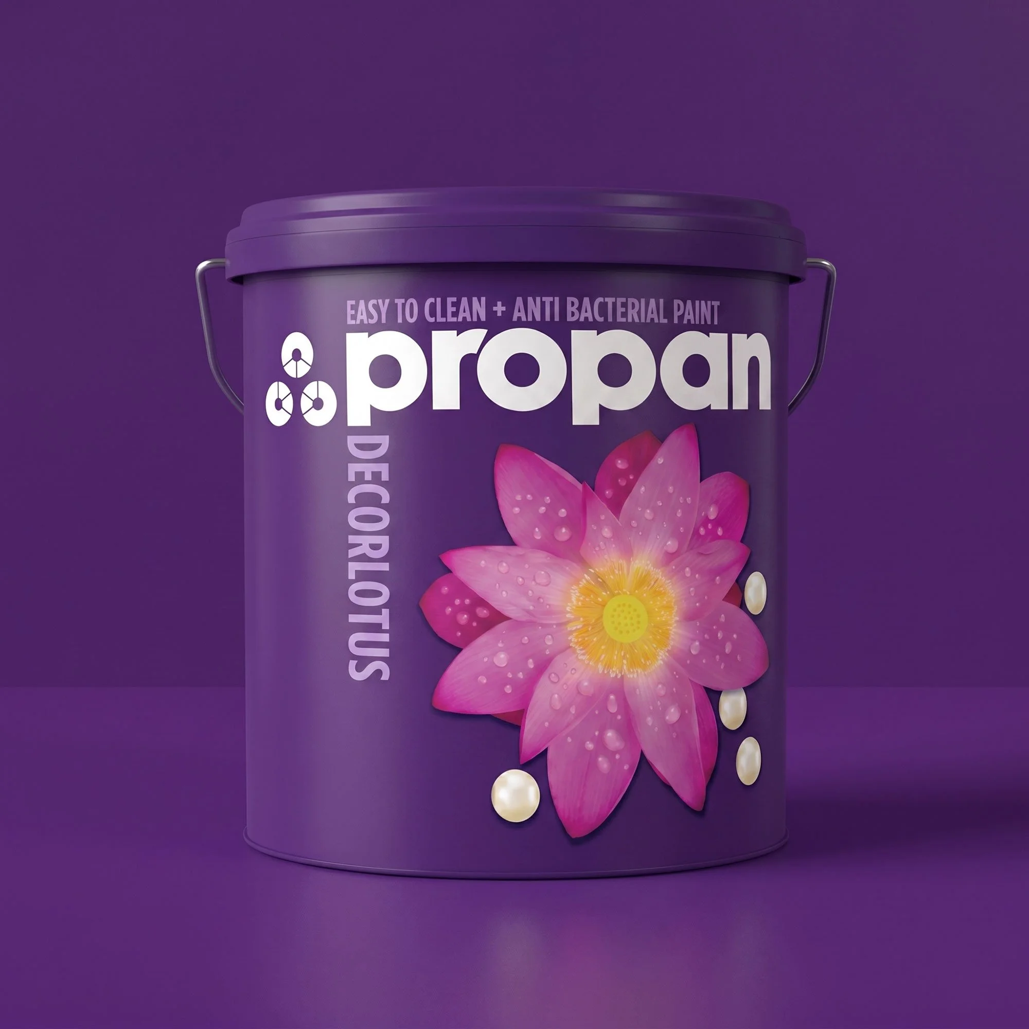
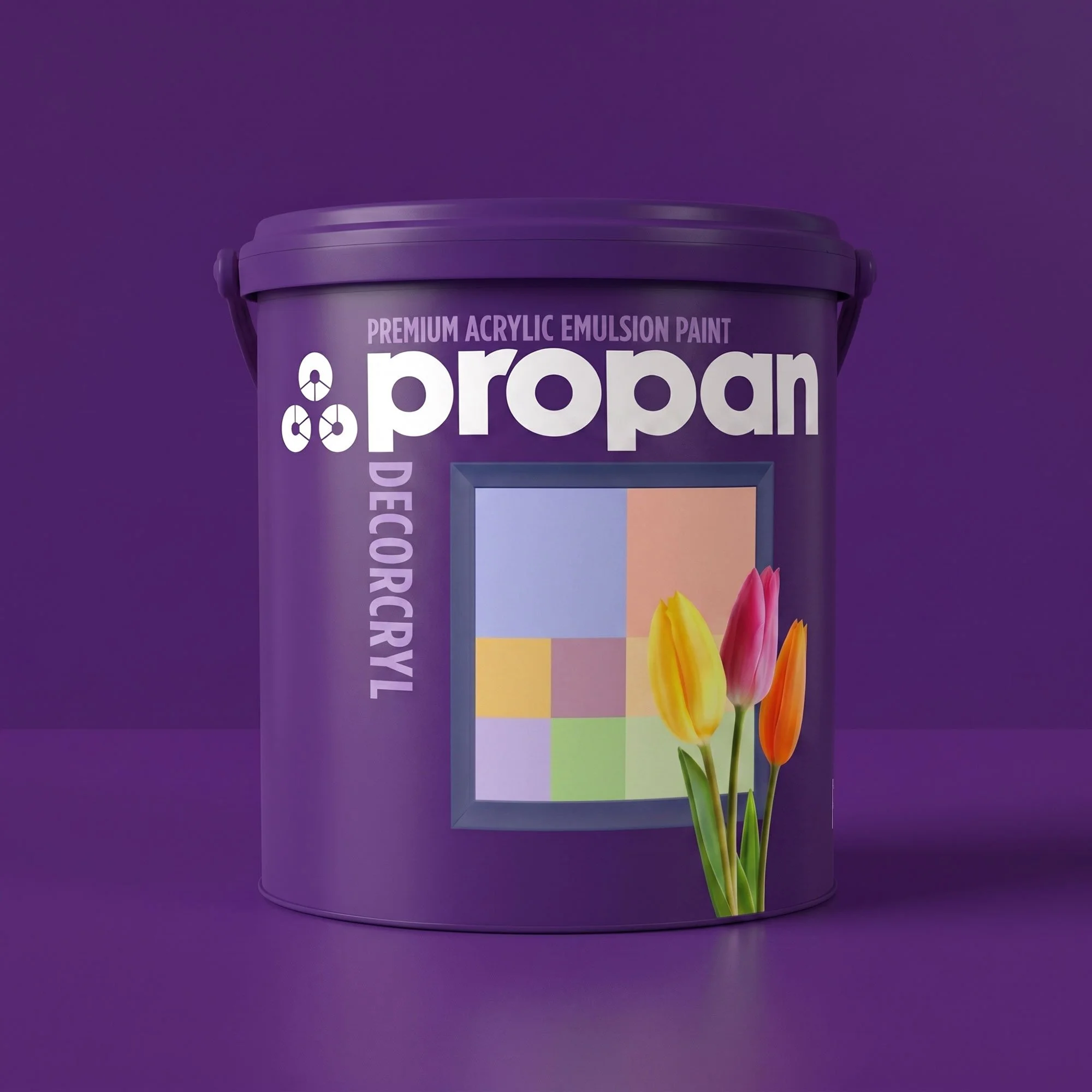
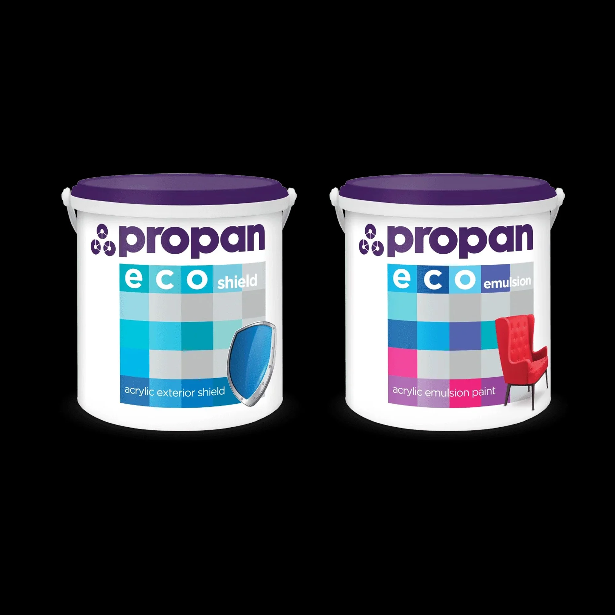
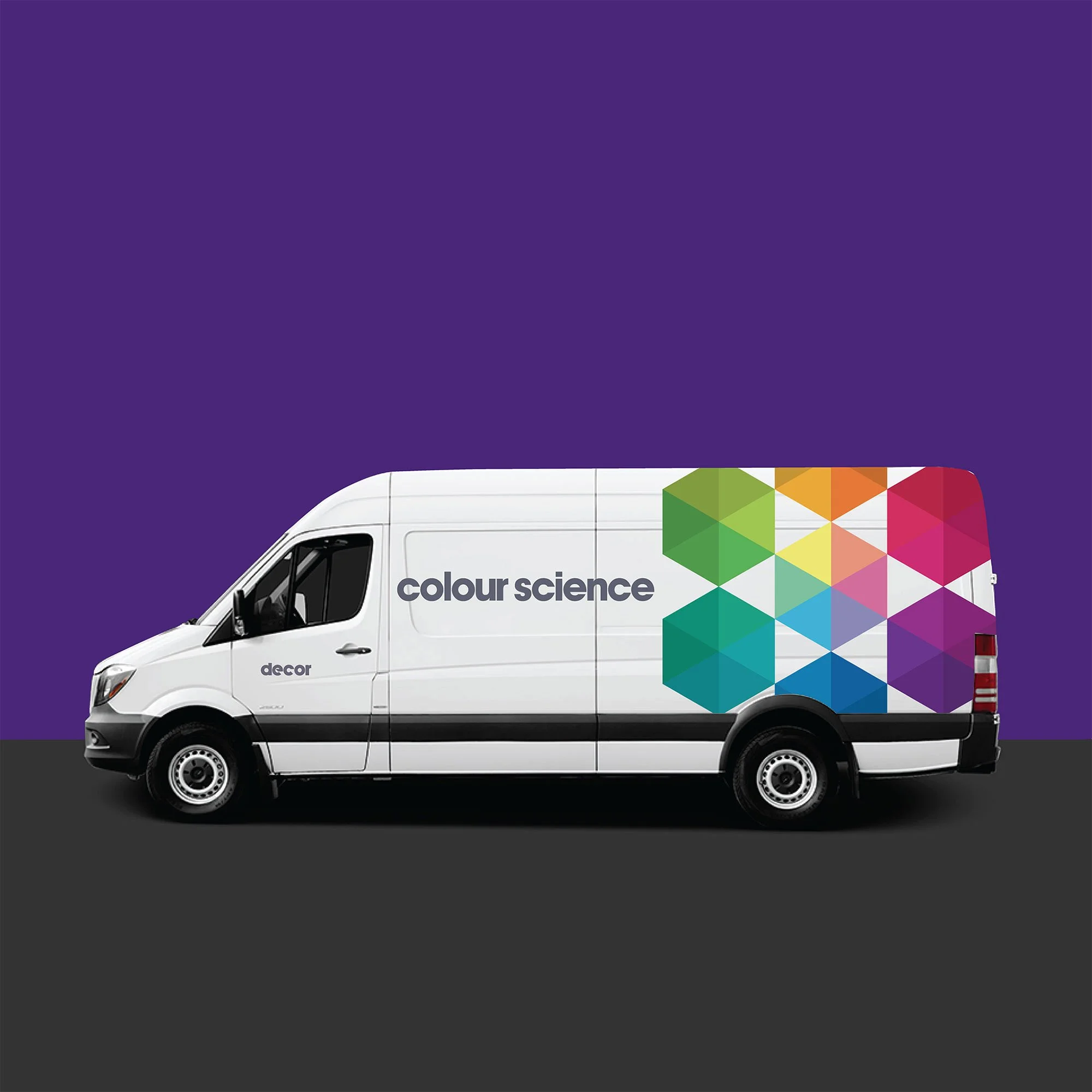
The packaging system carried Propan Purple as the master brand signal while allowing product-line differentiation underneath it, across ranges including Decorshield, Decor Primer, Decorlotus, Decorcryl and Propan Eco . The same identity extended beyond the shelf to vehicles, print advertising and point of sale.
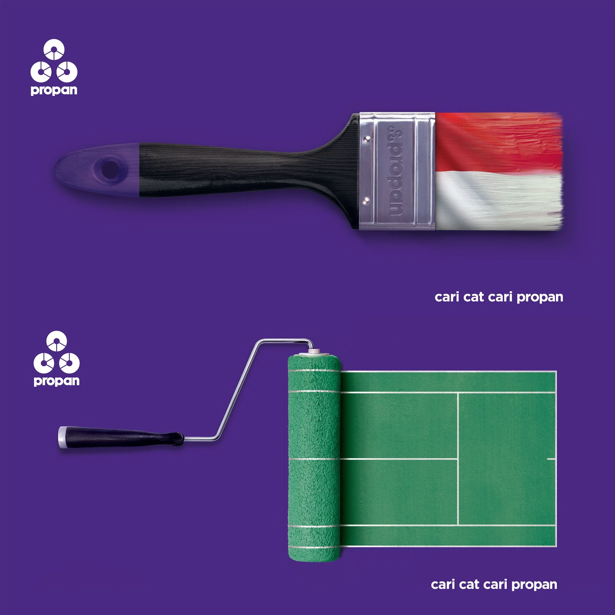
The campaign built on two lines designed for recall in the Indonesian market: “Think Paint, Think Propan” and “Cari Cat, Cari Propan.” Both work the same way: they embed Propan into the mental shortcut consumers use when a paint need arises, the same shortcut Impra had earned in varnish over decades. The campaign ran nationwide across the full decorative paint rollout.
The Outcome: Indonesia’s Largest Premium Local Decorative Paint Brand
Propan became Indonesia’s largest premium local decorative paint brand, built on corporate brand equity transferred from a category it owned into one where it had no standing. The visual identity system and campaign were designed to close that gap fast.