Aplus : Designing High-Recognition Corporate Identities for Building Materials Leaders
Unifying Expansive Industrial Portfolios Under One Distinctive Visual Presence
Elevating B2B and B2C Brand Recall : Brands Are Recognizable, Not Read
We drove the strategic visual identity development for Aplus, Southeast Asia's largest producer of high-quality building materials for both residential and commercial construction. The project required a brand strategy that successfully reinforces their unique market positioning as a comprehensive, one-stop shop capable of serving heavy industrial trades alongside individual home handymen.
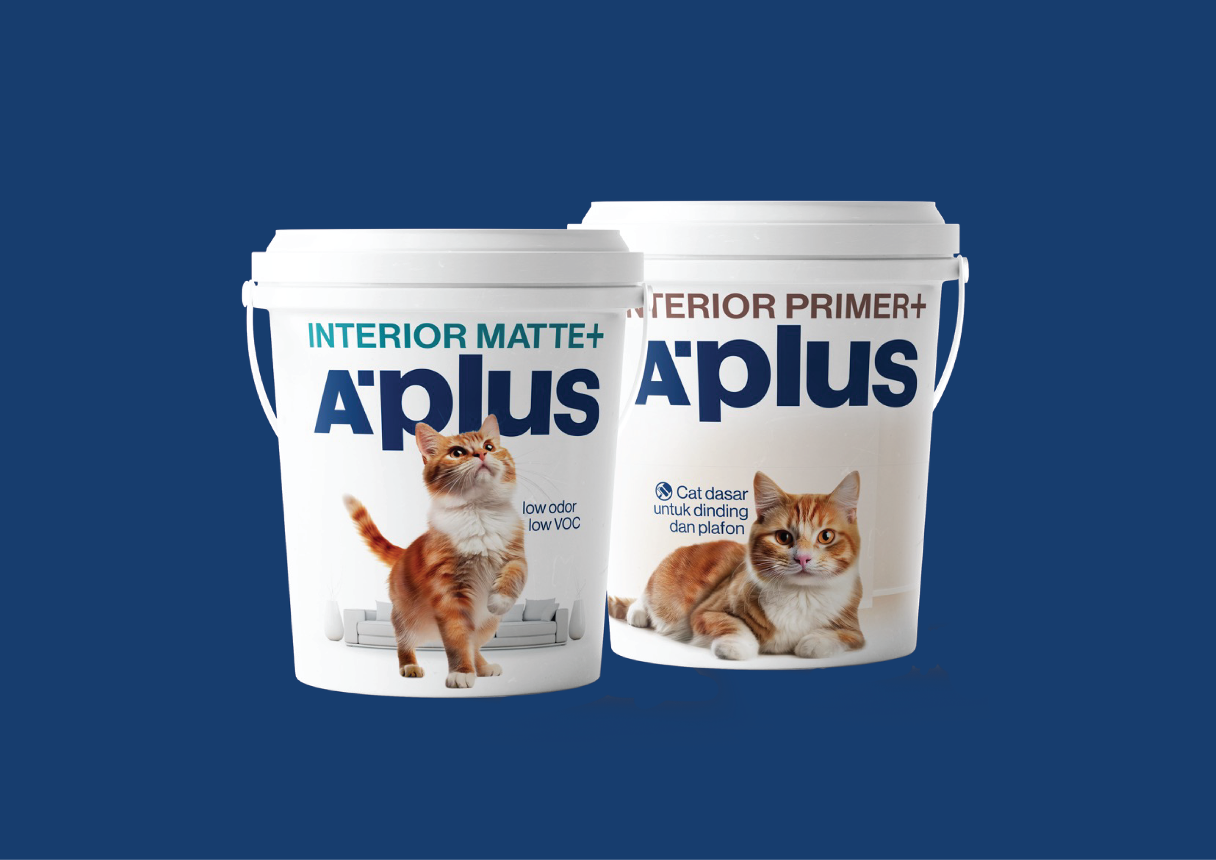
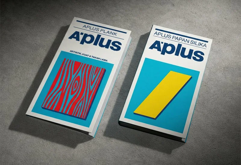
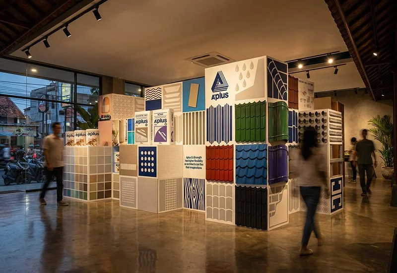
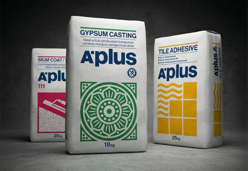
Our creative execution was guided by a foundational branding philosophy: brands are recognizable, not read. To visually communicate the vast range of solutions Aplus offers, we symbolized individual product lines and displayed them en masse. This strategic approach creates a powerful collective impact that demonstrates incredible consumer choice while ensuring the master brand maintains a highly distinctive, instantly recognizable visual presence across all touchpoints.
Key Strategic Focus Areas:
One-Stop Shop Positioning: Merging diverse manufacturing capabilities into a unified, market-leading corporate narrative.
Iconographic Product Symbolism: Developing intuitive, high-recall visual symbols to represent complex product categories.
Cross-Market Brand Dominance: Engineering a versatile graphic identity system that commands attention from professional contractors and retail consumers alike.