Ina Cookies: Revitalizing Corporate Brand Stories for Nationwide Retail Expansion
Transforming Heritage Founder Narratives into Scalable Product Naming Systems
Redesigning Group Brand Identities and Packaging Design for Competitive FMCG Retail Markets
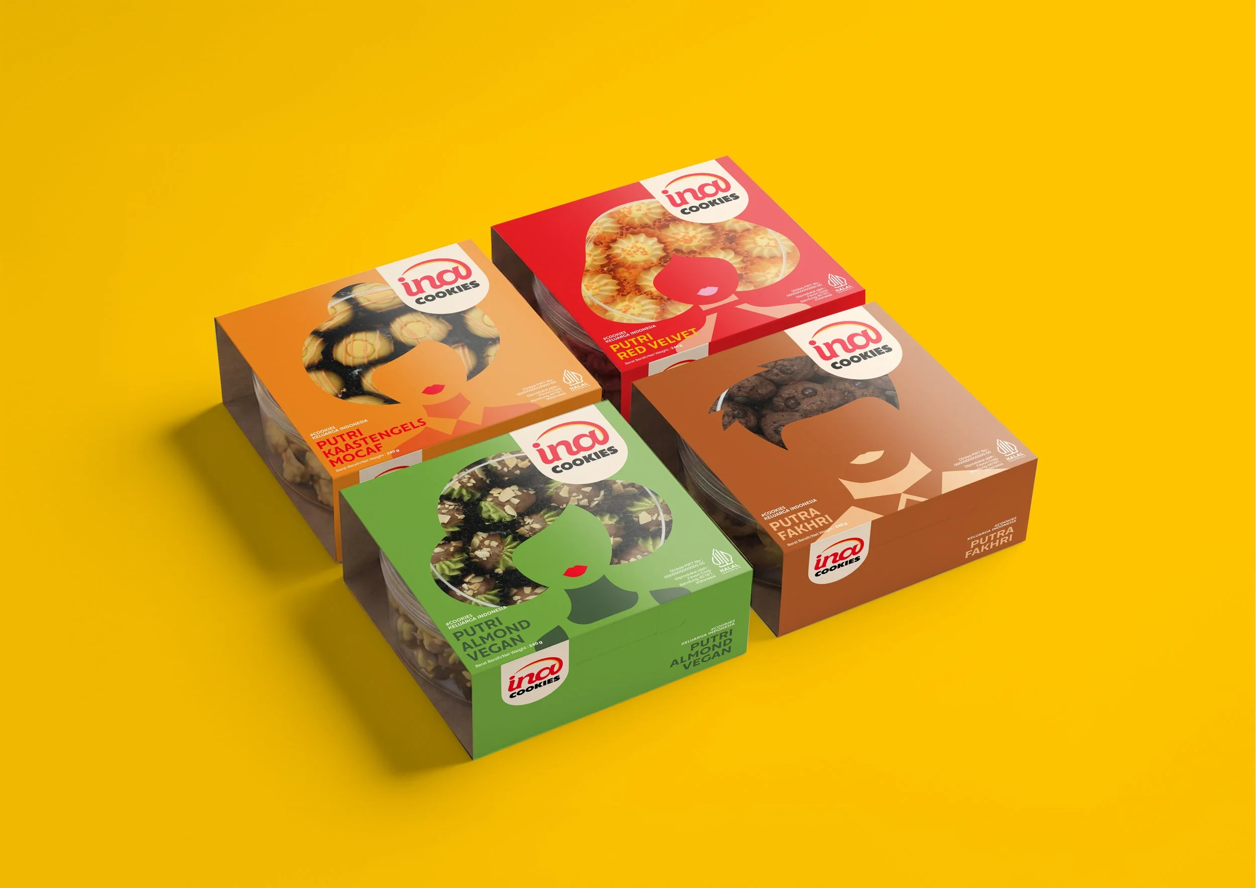
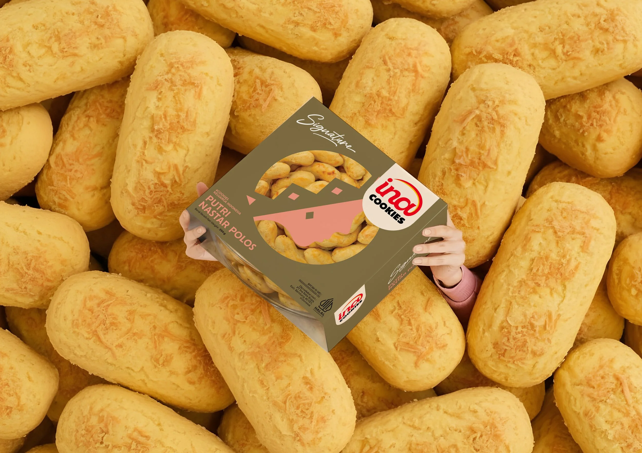
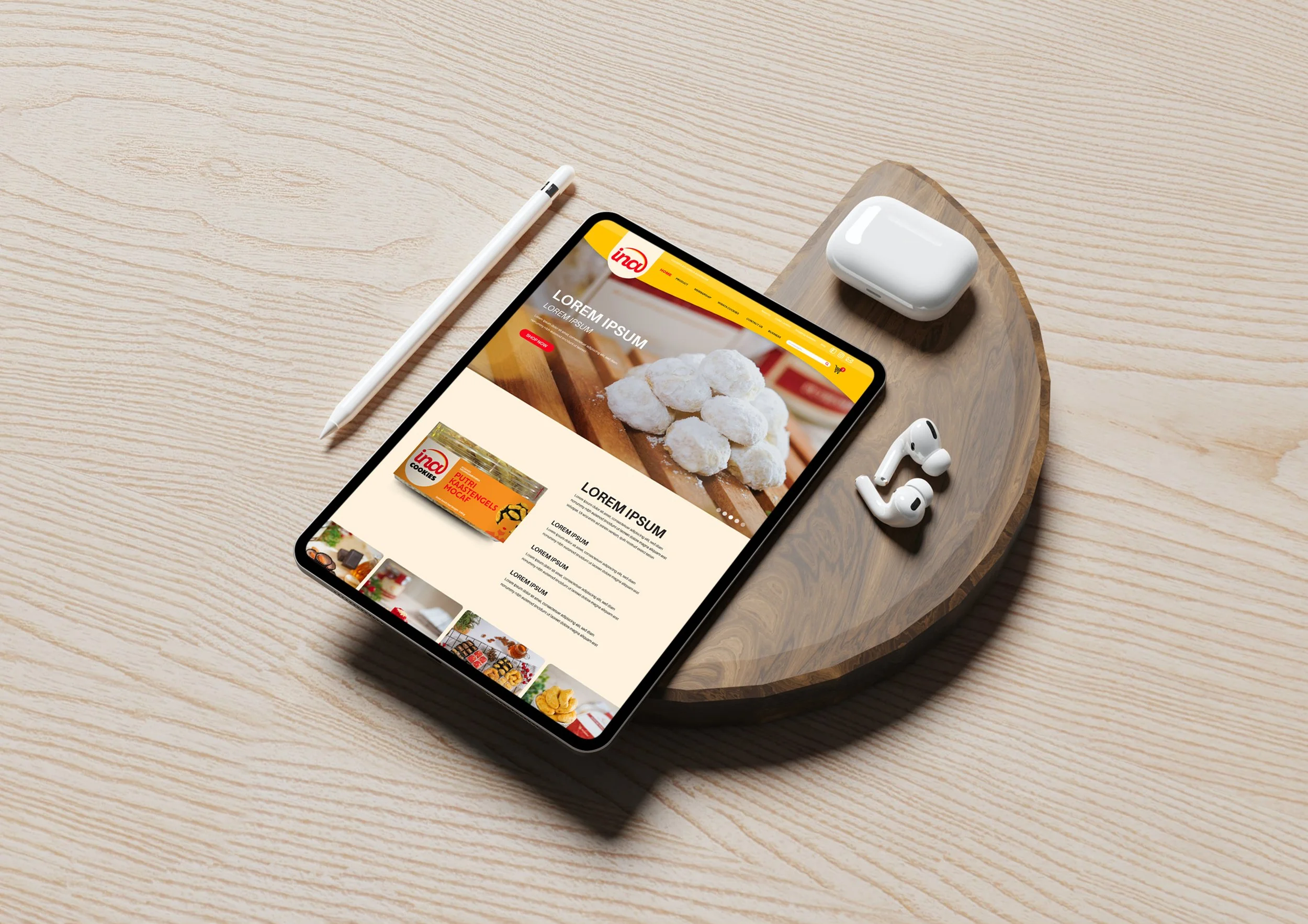
We led the comprehensive brand rebirth and packaging rejuvenation for Ina Cookies, preparing the beloved local confectionery maker for an aggressive nationwide retail expansion. Our mission was to modernize their shelf presence while preserving the emotional heritage established by the founder.
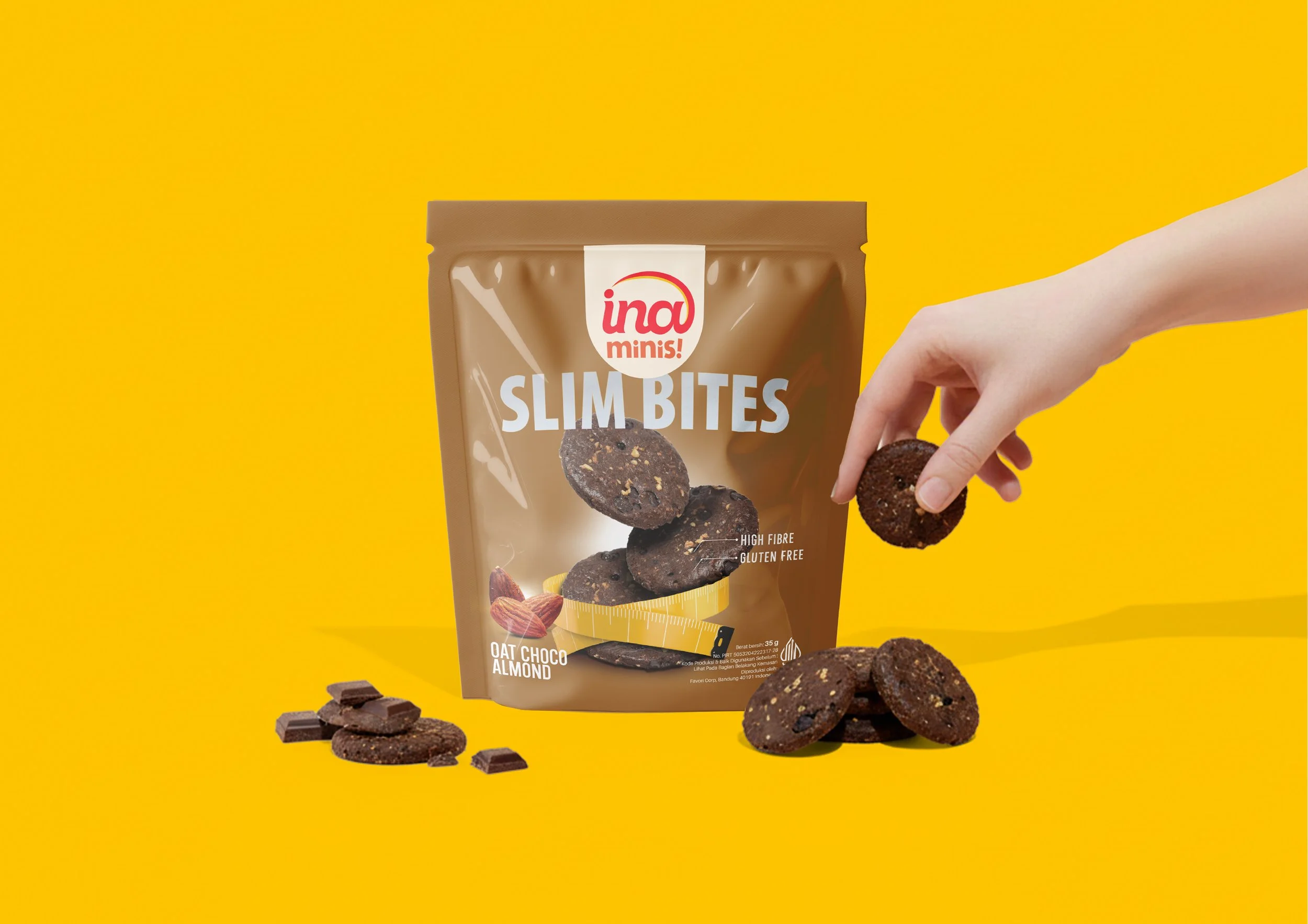
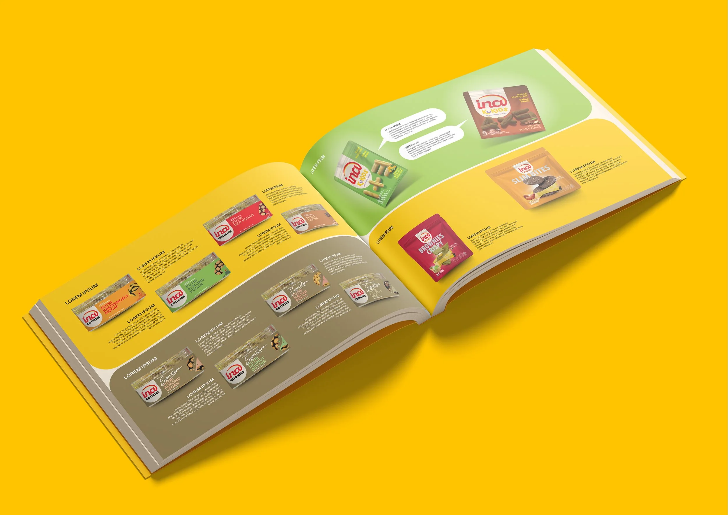
At the heart of Ina Cookies is a unique story: the owner treats each cookie recipe like their own child (putra-putri), giving every product a "Putra" or "Putri" prefix. We brought this legendary narrative back to the forefront. By executing a complete packaging rejuvenation, we transformed their traditional containers into sleek, modern retail assets. This refreshed visual identity proudly displays the iconic putra-putri naming system, allowing the Ina Cookies Group corporate brand to command consumer attention on competitive supermarket shelves.
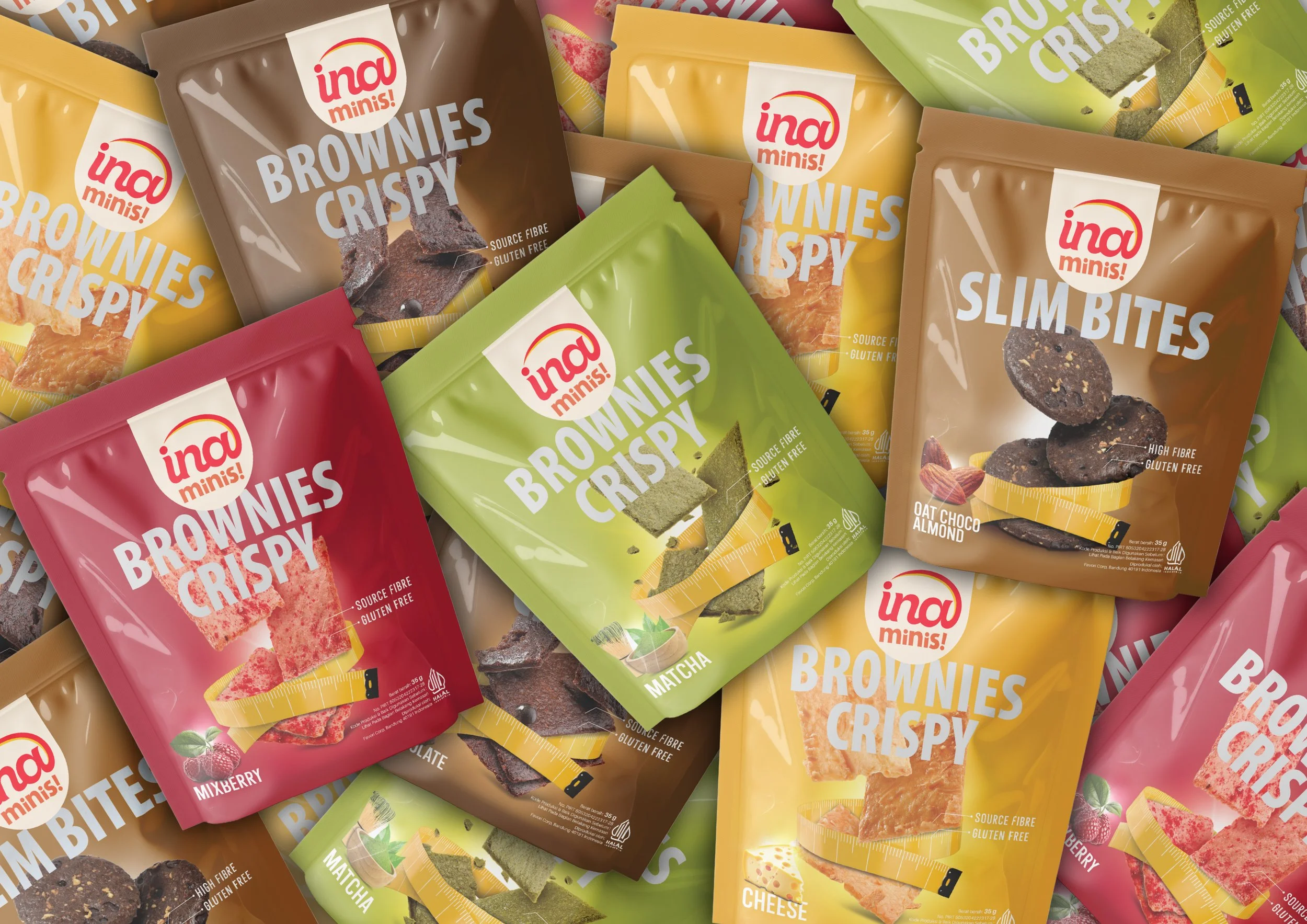
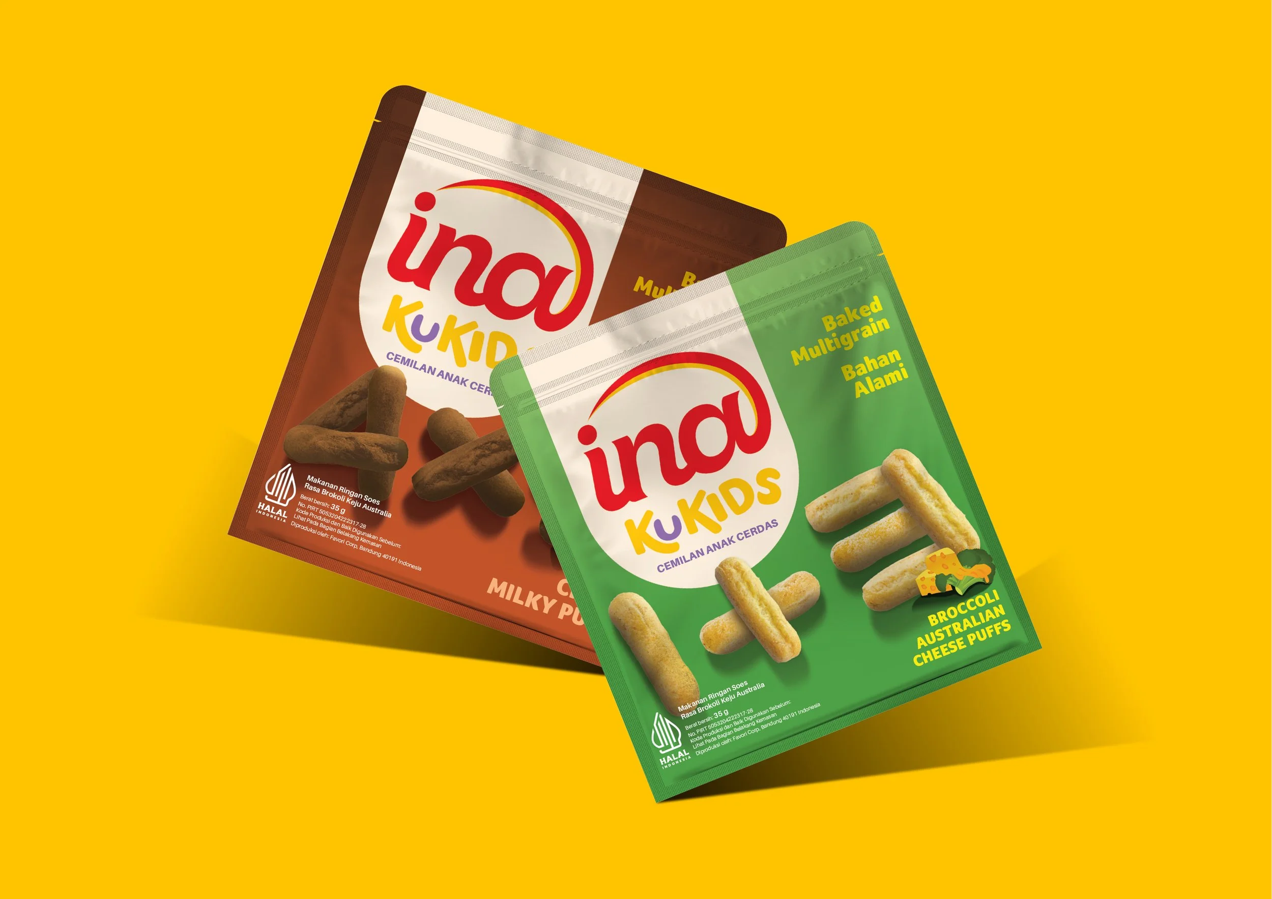
Packaging Rejuvenation: Modernizing visual labels and structural layouts to enhance shelf-velocity and premium appeal.
Narrative-Driven Naming: Systematizing the iconic putra-putri prefix across current lines to trigger high consumer recall.
Group Identity Redesign: Crafting a polished master brand mark optimized for modern, mass-market retail environments.