Pronas: Modernizing a 70-Year Heritage Brand for Next-Generation Consumers
Pronas: Turning One Iconic Product into a Portfolio Brand
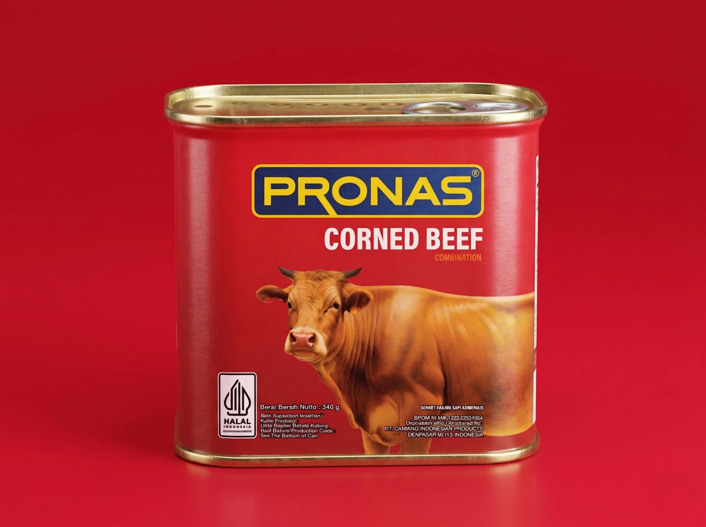
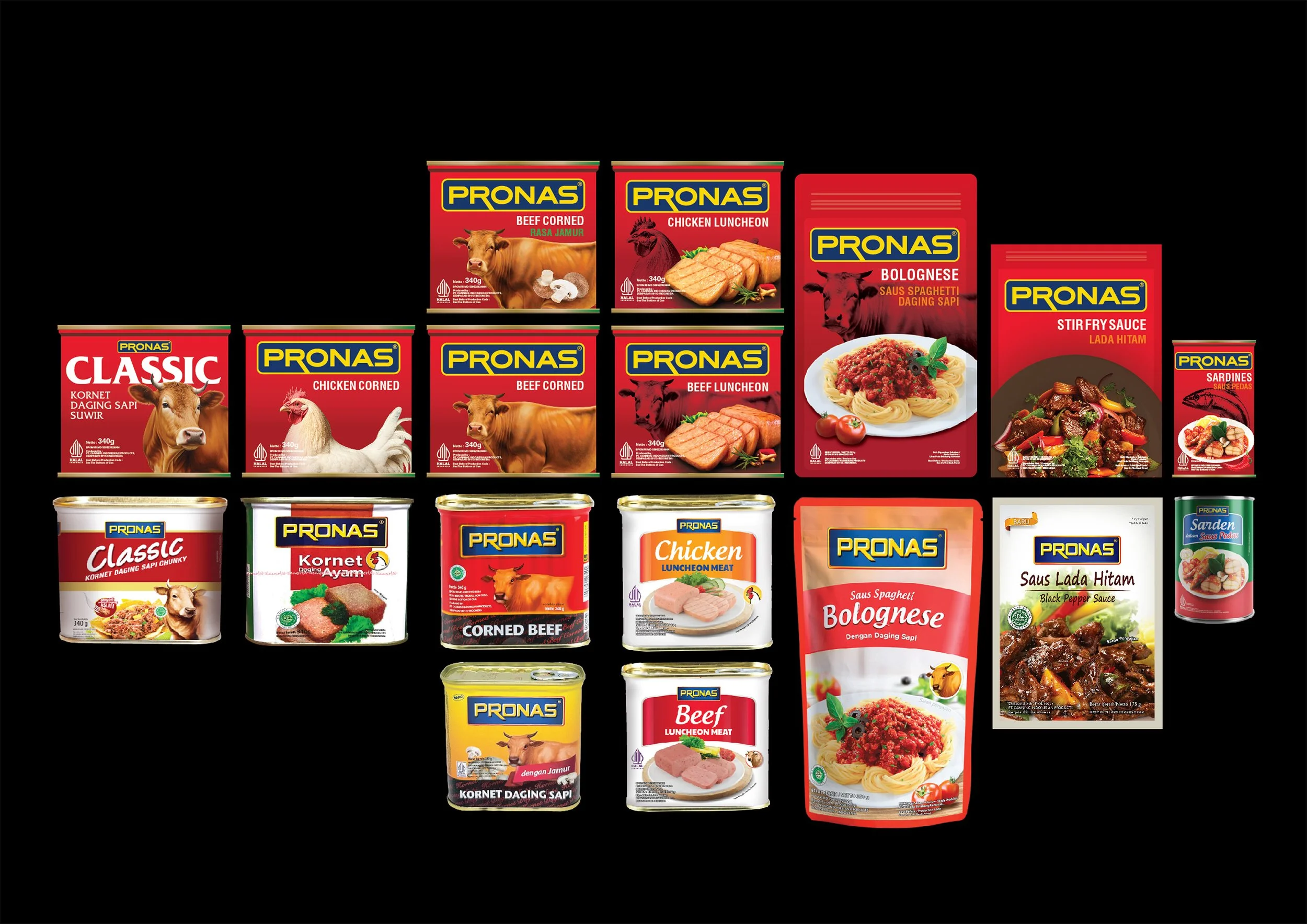
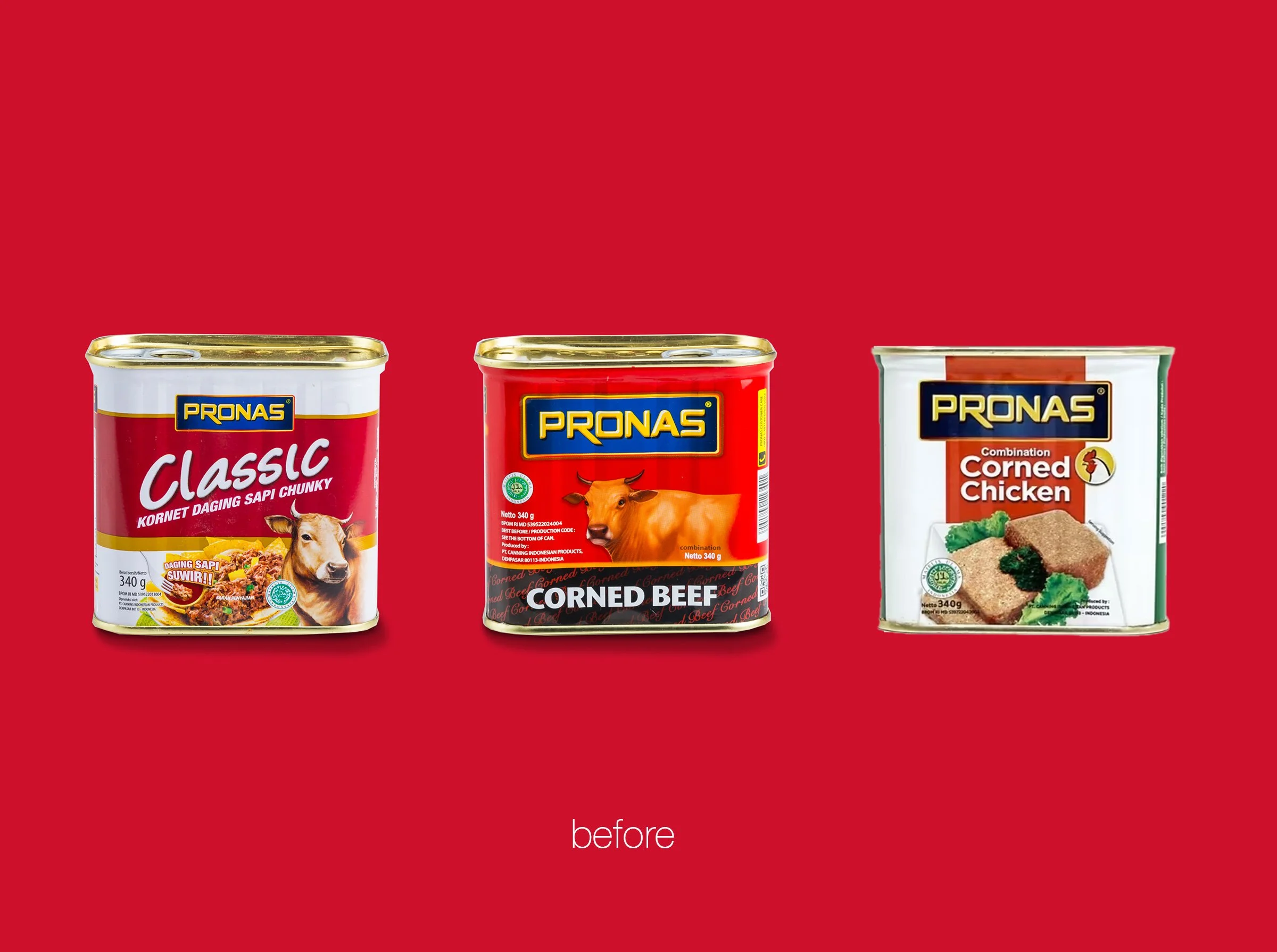
Pronas had one of Indonesia's most recognisable food packaging assets and was barely using it. The corned beef tin, with its red background, cow illustration and prominent Pronas logo, had 70 years of consumer trust behind it. Walk down the canned food aisle and buyers reached for it almost instinctively. Then they would look at the rest of the Pronas range: canned fish, sambal, bumbu, pasta, vegetables and fruit, each product carrying its own visual logic, with very little connecting it back to the equity sitting on that corned beef tin. The portfolio looked more like a collection of unrelated products sharing a company name than one coherent brand family.
This revealed a broader strategic issue. Pronas had continued to expand its portfolio, but adding more SKUs was not necessarily making the brand stronger. In fact, the opposite was beginning to happen. As more products entered the range with their own visual identities, claims, colours and packaging styles, the brand became increasingly diluted. Each product was effectively being asked to stand on its own and fight individually for attention and sales, rather than contributing to the strength of Pronas as one collective brand.
The commercial loss was significant. A shopper loyal to Pronas corned beef had little visual reason to immediately recognise or transfer that trust to Pronas sambal, canned fish or other categories sitting nearby. Decades of brand investment in one iconic product were not being leveraged across the wider portfolio. Instead of every new SKU reinforcing Pronas, each one risked adding another layer of visual noise and fragmentation.
At the same time, younger consumers, particularly millennial and Gen Z buyers increasingly shaping Indonesian grocery purchasing, found little in the existing visual system that felt contemporary or relevant. The brand read as old, and not always in the reassuring sense of heritage and reliability.
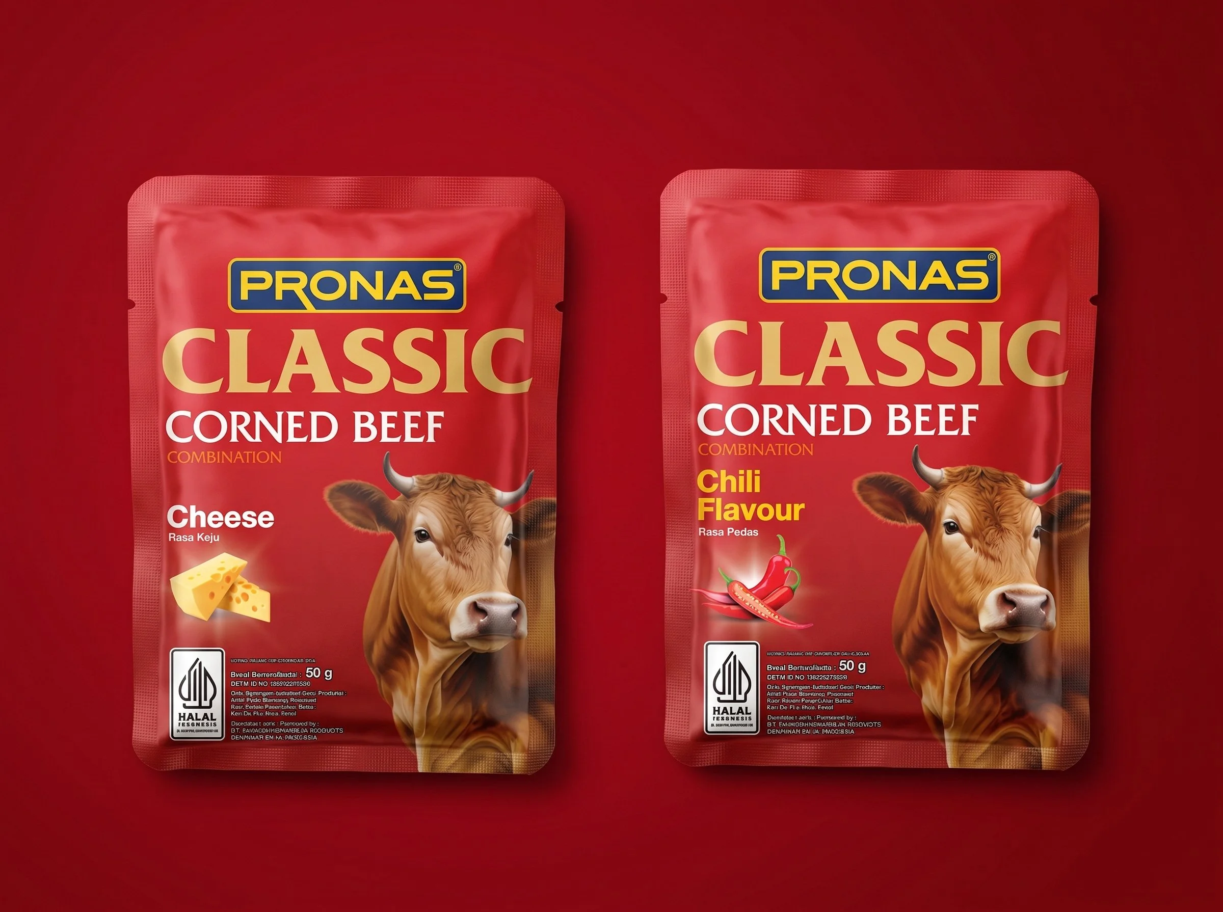
Komunikasia developed the brand strategy, brand identity, packaging system and full portfolio architecture. The FMCG Packaging Design recommendation was to stop treating every SKU as an isolated design problem and instead build a cohesive visual system around the assets consumers already recognised and trusted.
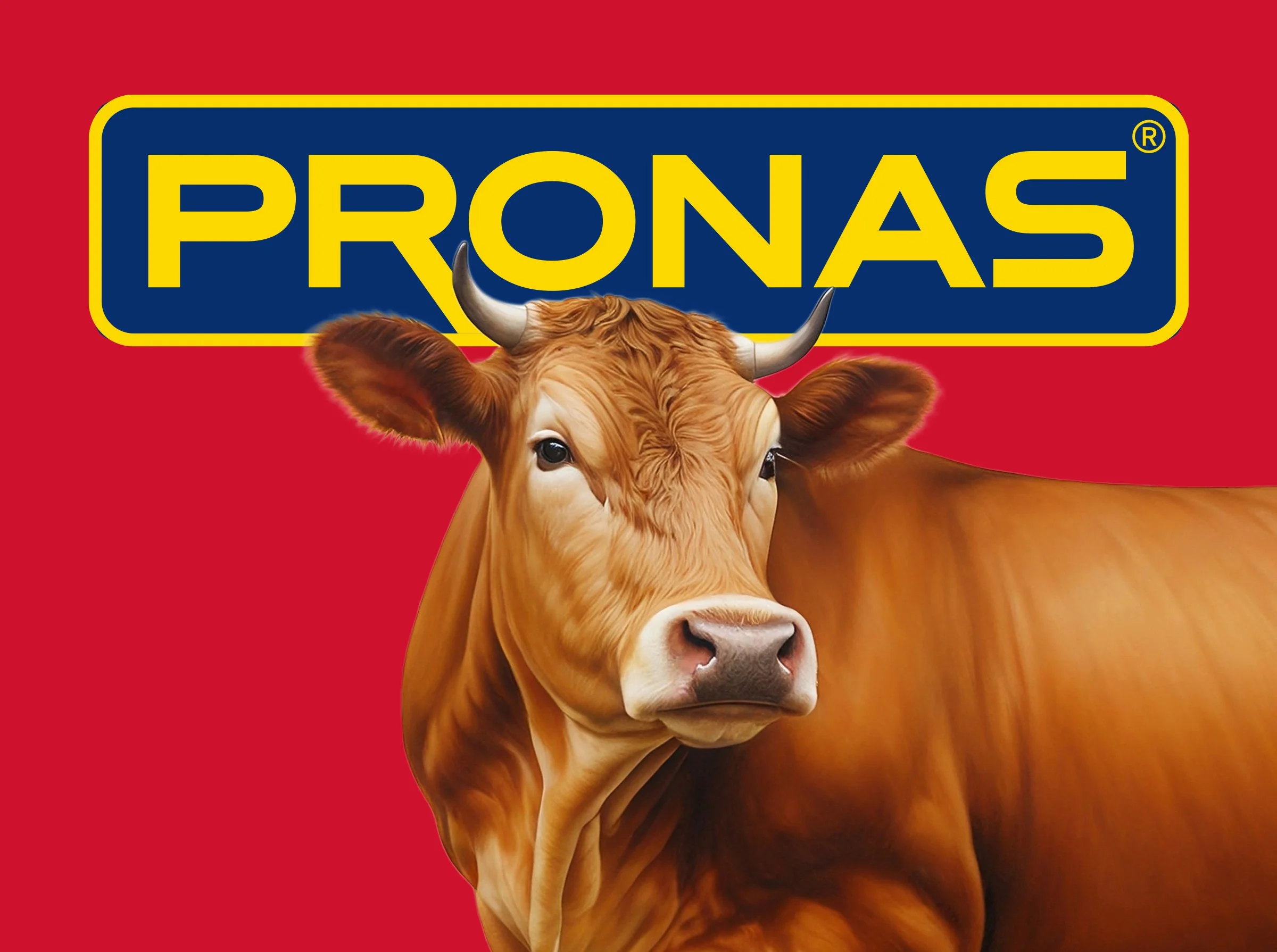
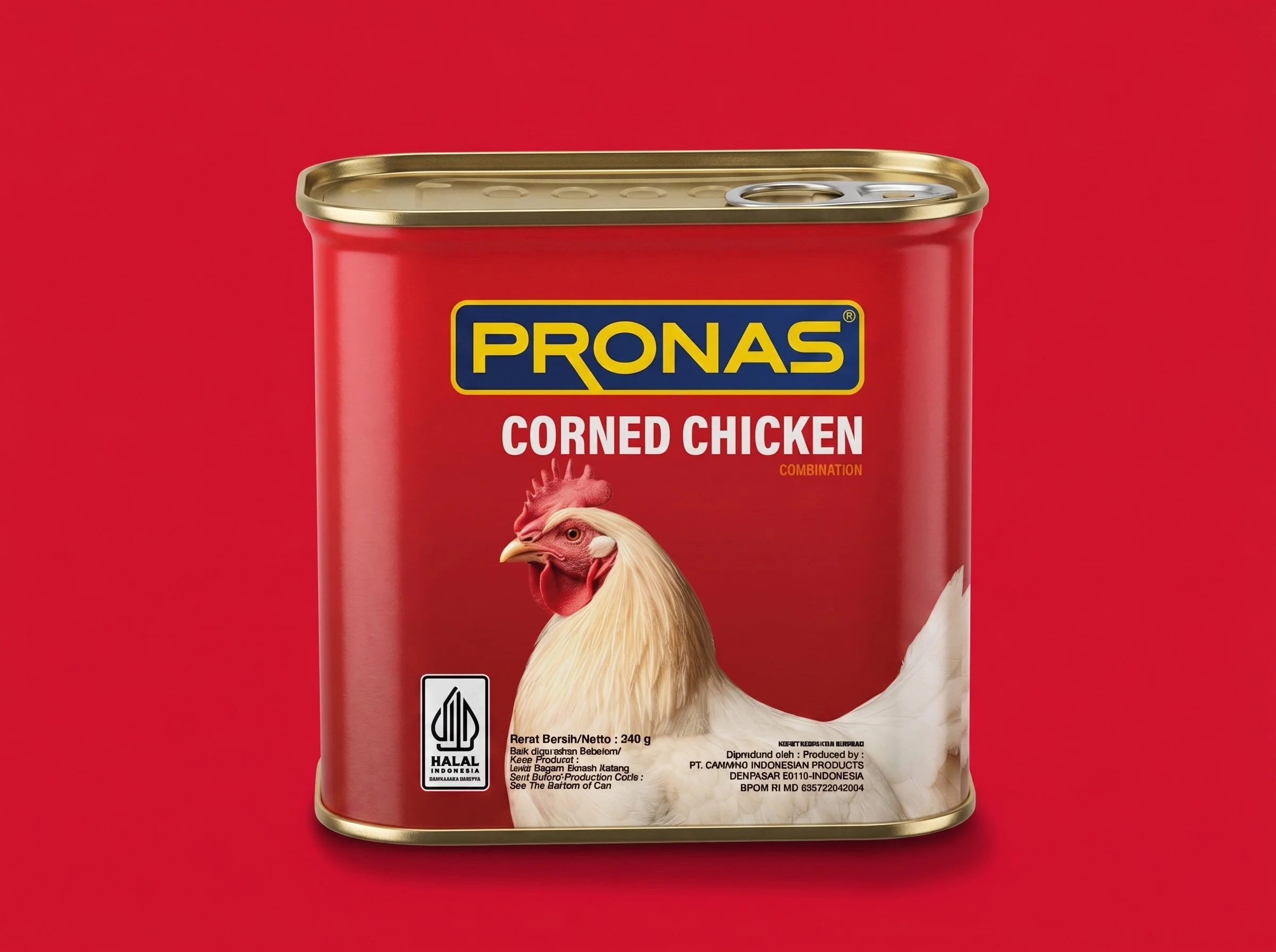
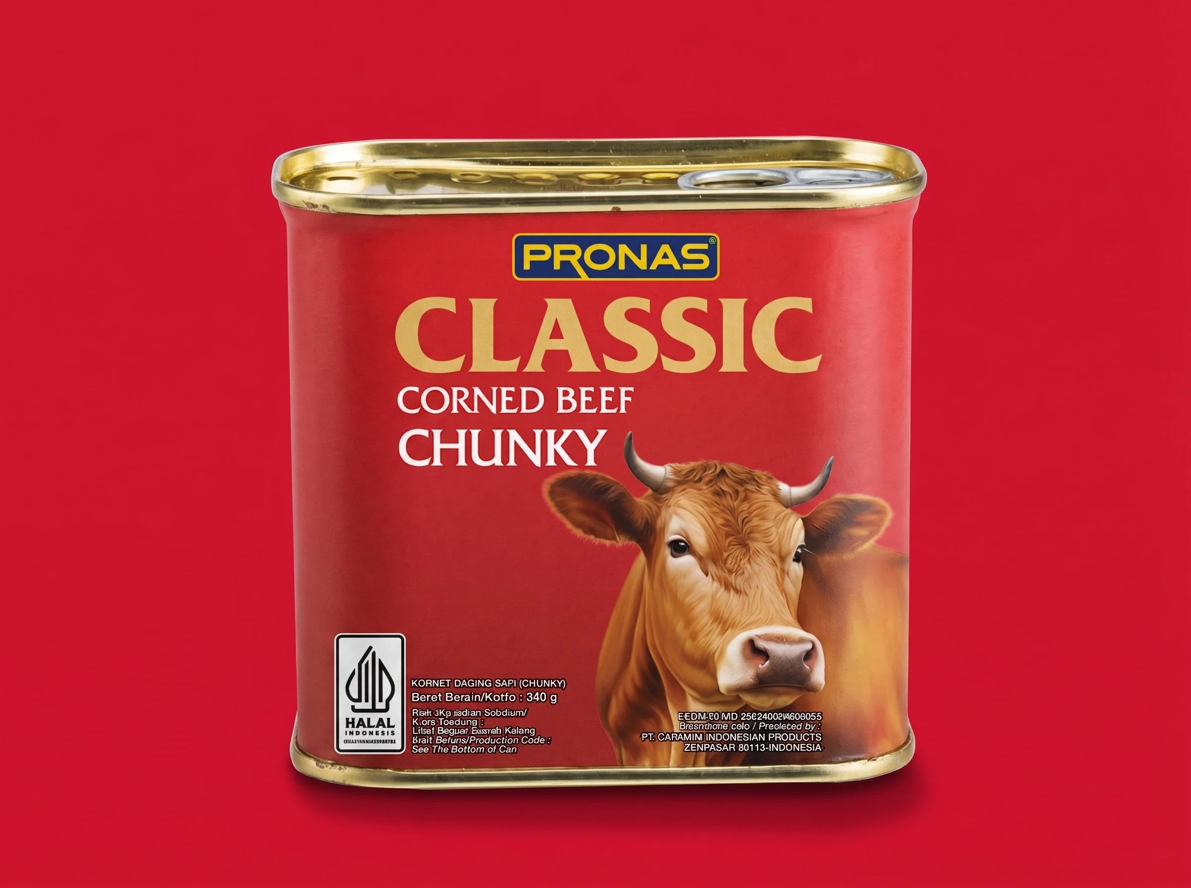
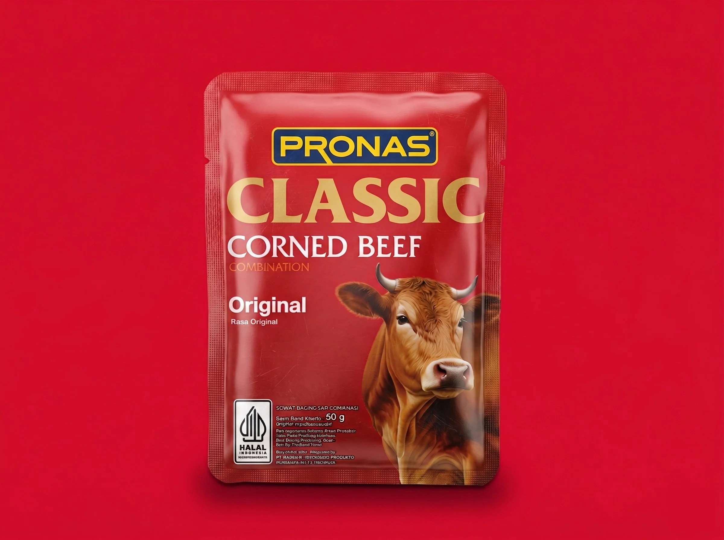
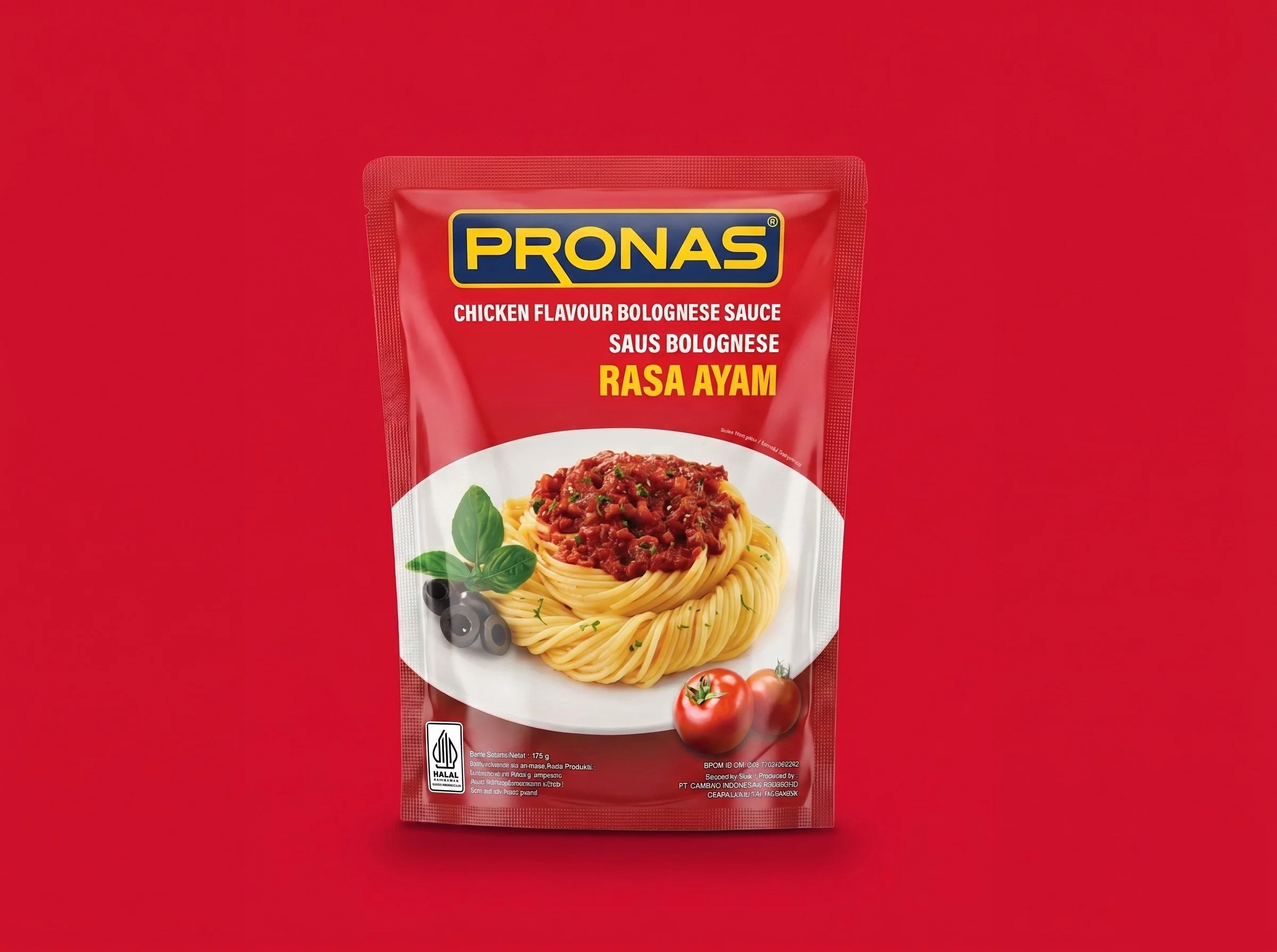
The corned beef tin became the starting point. Red was established as the dominant corporate colour. The cow illustration was retained as a valuable brand asset and evolved rather than replaced. The Pronas logo was brought forward as the master brand driver across every product category, from canned meat and fish to fruit, condiments and cooking ingredients.
The packaging architecture then gave each category enough distinction to help consumers navigate the range, while keeping every SKU recognisably part of the same Pronas family. Instead of individual products competing separately for attention, the portfolio began working collectively. Every pack helped reinforce the next one. Every additional SKU added to the visual presence of Pronas rather than weakening it.
The result was stronger shelf blocking: a Pronas section that reads as one substantial brand rather than a fragmented collection of products. More importantly, the system created a foundation where future portfolio growth could strengthen the master brand instead of continuously adding complexity.
The outcome:
Stronger retail visibility through shelf presence that finally reflected the scale of the portfolio, improved brand recognition across non-corned-beef categories, and a more cohesive visual system in which each SKU contributes to building Pronas as one brand. The new system also made Pronas more relevant to younger consumers without abandoning the heritage cues and recognition that had kept loyal buyers choosing the brand for generations.